
Table of Contents
Picking a paint color for a bedroom that’s meant to help you unwind is harder than it sounds, because “calming” and “cozy” don’t always come from the same place. A pale blue can feel serene but chilly. A rich brown can feel warm but heavy. The colors below strike that balance — soft enough to quiet the room, warm enough that it still feels like somewhere you want to fall asleep. Here are 15 cozy calm bedroom paint colors worth putting on your sample list, along with real shades to look up.
15 Cozy Calm Bedroom Paint Colors That Actually Work
Most “calming” paint guides sort colors by hue alone — blue, green, gray — but hue is only half the story. The undertone hiding inside a color determines whether it reads as cozy or cold in your specific room, which is why the same “soft blue” can look completely different in two houses.
The 15 colors below are grouped the way a designer would actually choose them: by the mood each one creates once it’s on a wall, not just its name on a chip. Each entry notes what kind of room and light it tends to work best in, since that changes how every one of these cozy calm bedroom paint colors actually reads day to day.
Warm White for a Soft, Cozy Backdrop
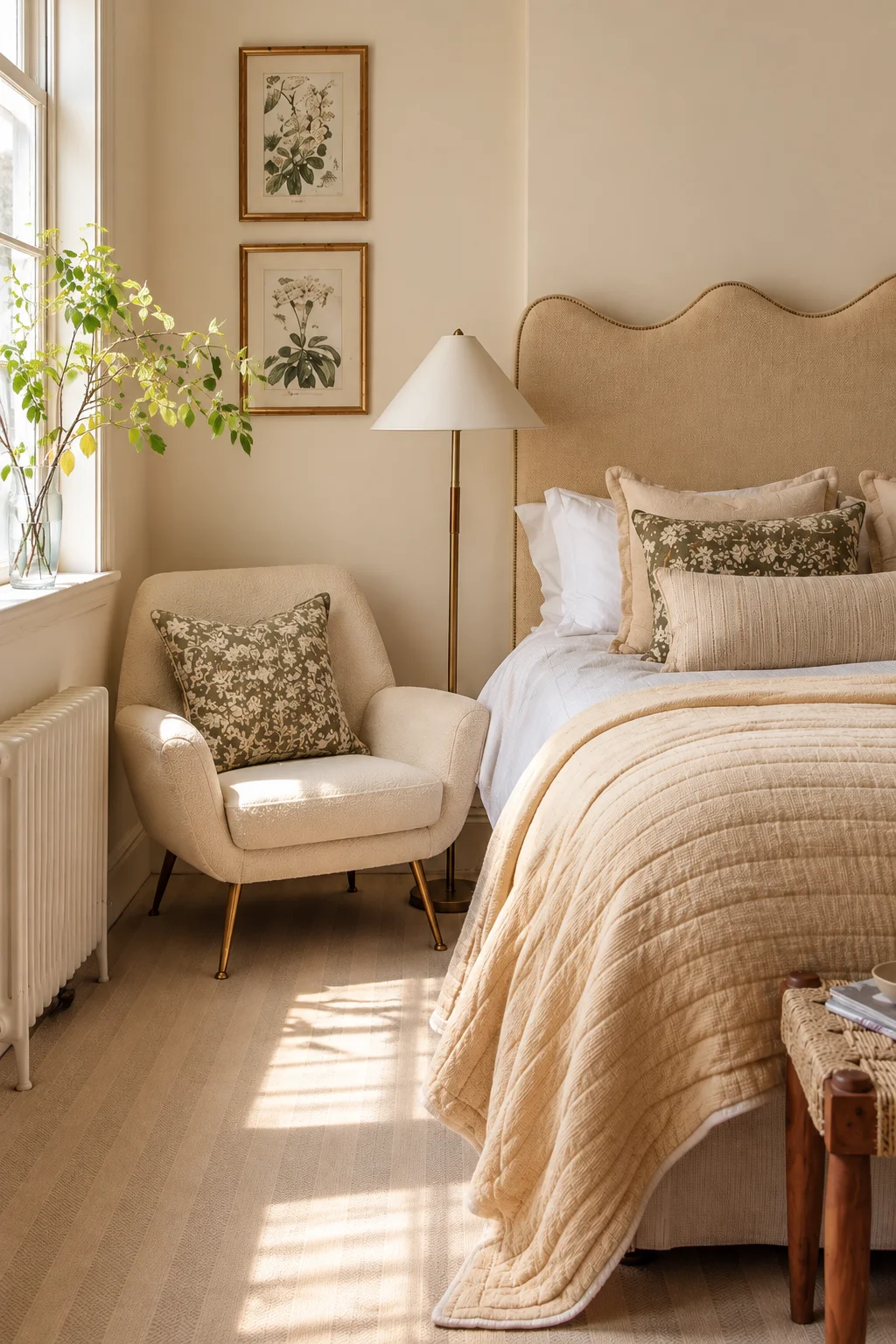
A true warm white avoids the stark, clinical look that pure white can create, instead reading as soft and enveloping. Roman Column SW 7562 by Sherwin-Williams is a commonly recommended option here, working well on both walls and trim for a calm, spacious feel.
This shade pairs naturally with beige and black accents for a grounded look, or with natural wood furniture for something softer. It’s a strong starting point if you want a cozy neutral that won’t compete with bedding or art you plan to change over time.
Warm Greige for Calm That Isn’t Cold
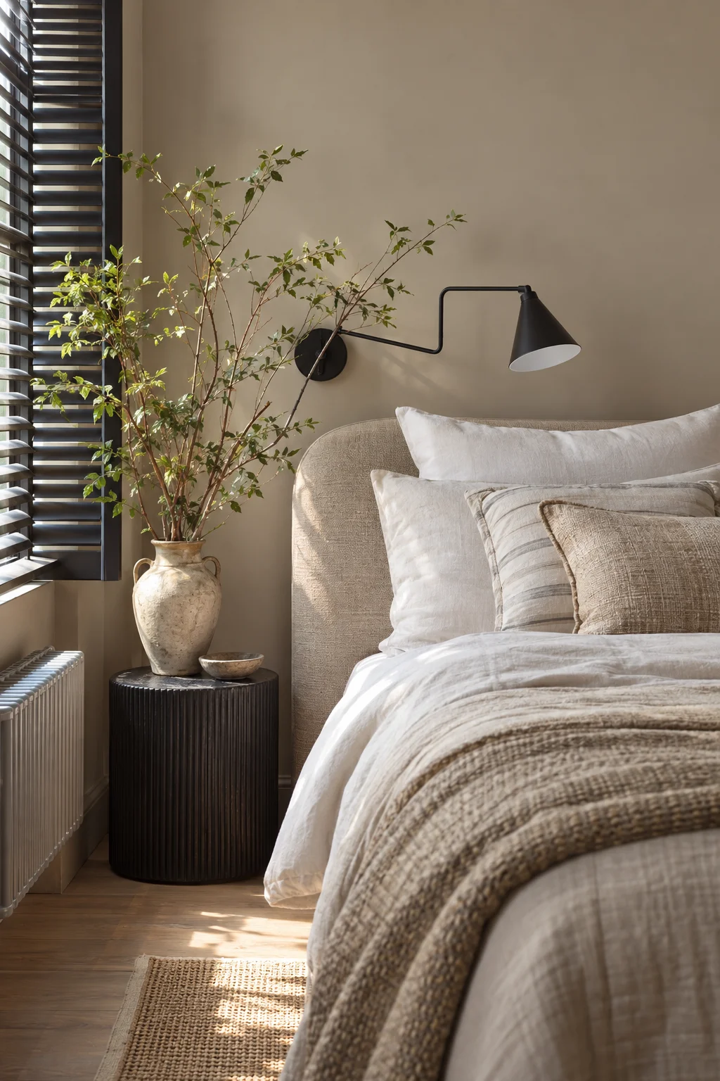
Greige — a blend of beige and gray — sits in the middle of the undertone spectrum, which is why it works in so many bedrooms. It reads as refined rather than plain, and its warm undertone keeps it from feeling as cold as a straight gray can in low light.
Because greige is neutral without being flat, it works in both minimalist and more layered bedrooms, letting bedding and furniture carry more of the personality. It’s dependable if you’re not sure which direction to go and don’t want to repaint when your decor changes.
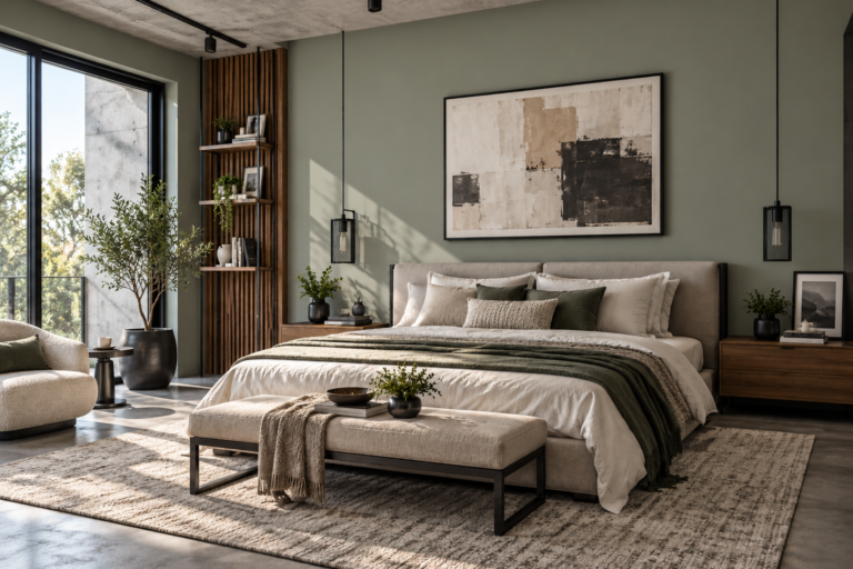
Soft Sage Green for a Grounded, Natural Feel
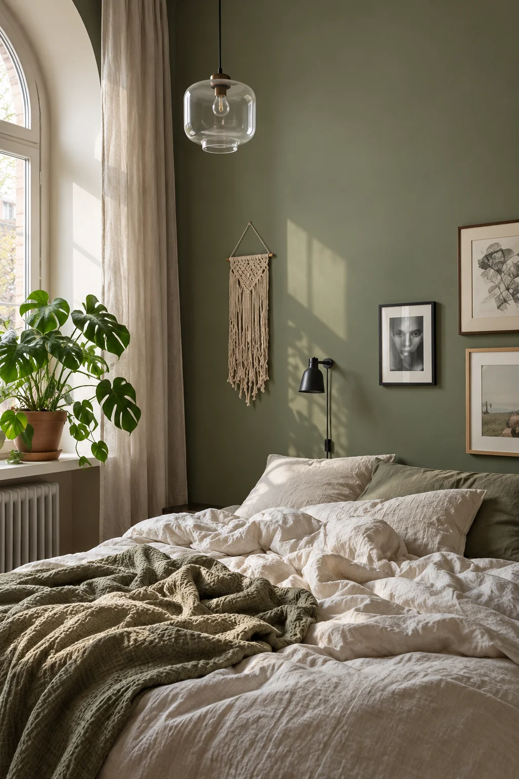
Green is one of the most consistently recommended calming bedroom colors because it echoes outdoor tones the eye already associates with rest. October Mist 1495 by Benjamin Moore is a well-known soft sage option, along with similar muted greens like White Sage from PPG.
These shades work especially well with warm wood tones, linen textures, and brass hardware, which reinforces the natural, grounded feeling the color already carries. Sage tends to shift slightly warmer or cooler through the day, which many people find adds to the calm rather than distracting from it.
Blue-Green for a Spa-Like Calm
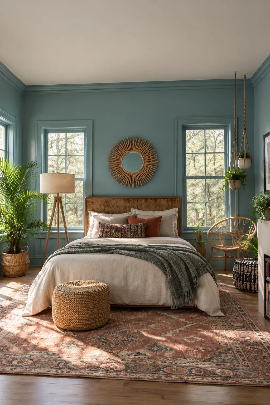
Blue-green borrows blue’s coolness and green’s warmth, sitting right between the two most reliably calming hues. Underseas SW 6214 by Sherwin-Williams is a muted example, closer to a soft ocean tone than a bright teal.
This color works best layered with neutral linens rather than bold contrast, since the goal is a quiet, spa-like effect rather than a statement wall. Pairing two shades of blue-green in one room — bedding a touch lighter or darker than the wall — tends to look more intentional than adding a single unrelated accent color.
Slate Gray for a Cozy, Modern Retreat
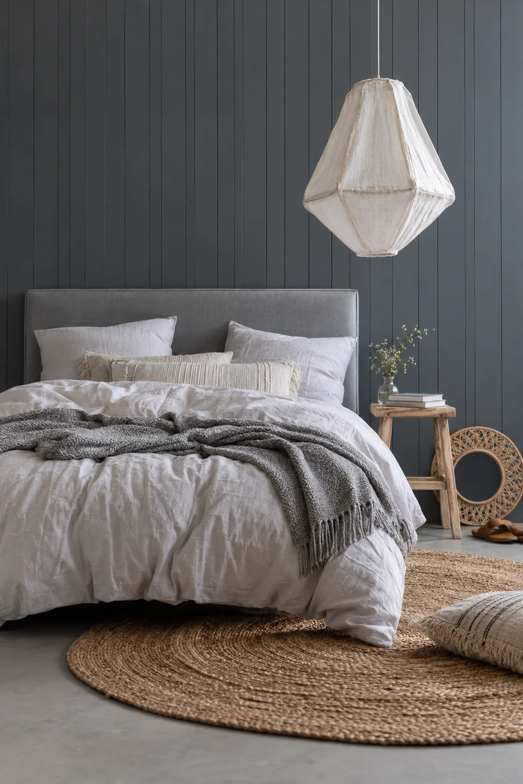
Slate gray is a clean, modern option that still feels warm once texture is introduced, which separates it from a flatter, more sterile gray. It works well as a grounding wall color in bedrooms that lean contemporary, especially when softened with cotton drapes or a wool rug.
Because it’s neutral enough to pair with almost anything, slate gray is a practical choice for bedrooms that double as a workspace — calm enough for rest but not distracting enough to interfere with focus during the day.
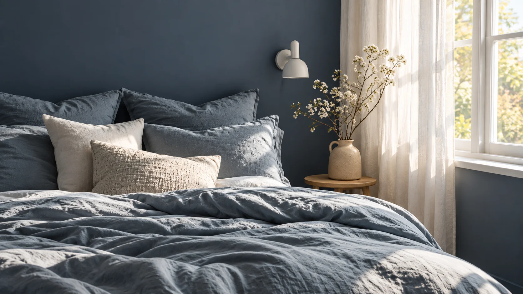
Deep Gray-Blue for Cozy Through Depth
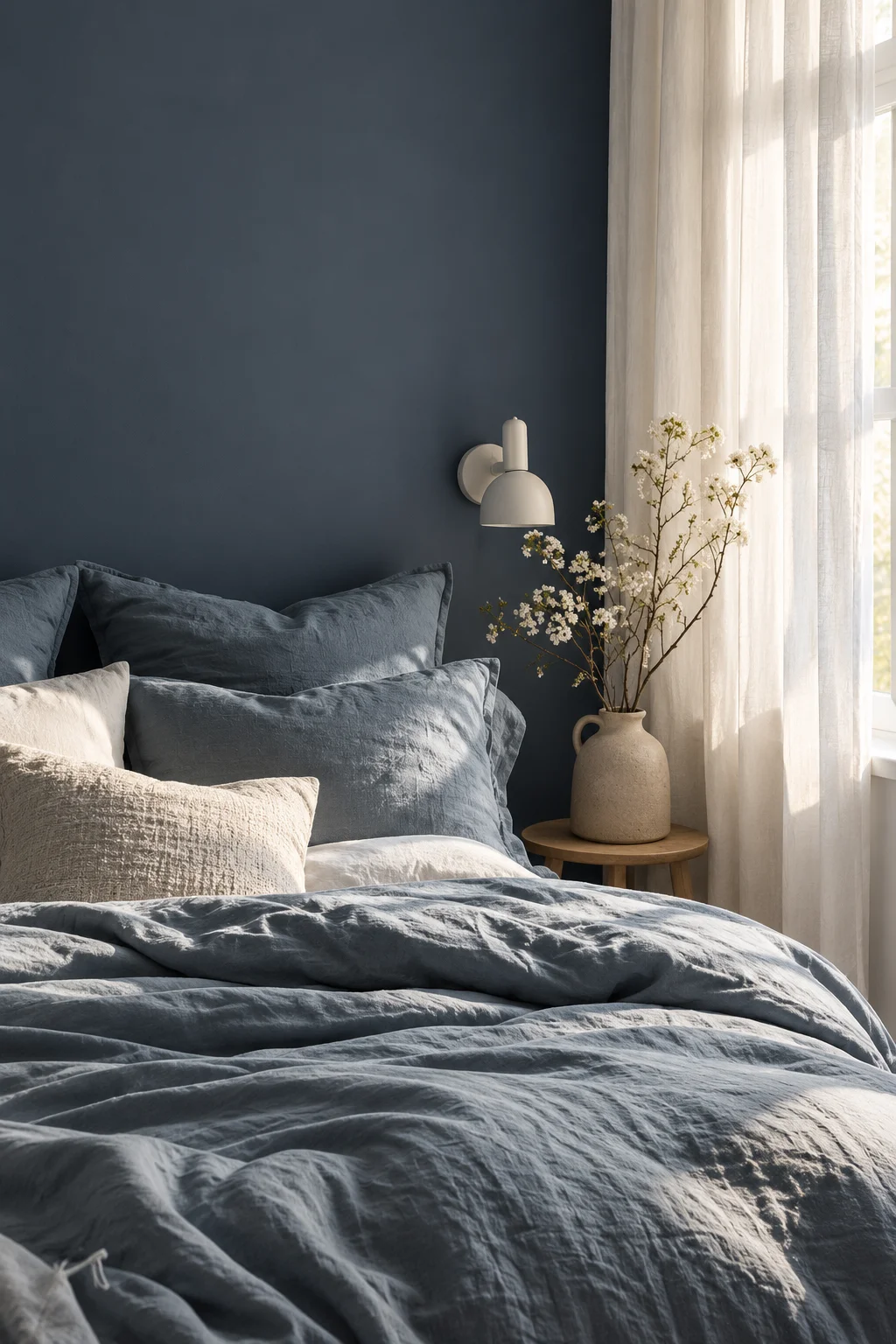
Not every cozy calm bedroom paint color needs to be light. A deep gray-blue like Rain Cloud from Sherwin-Williams bridges classic and contemporary styles, and its depth reads as calming rather than heavy once paired with the right accents.
Bright white trim and bedding keep a dark wall color like this from making the room feel smaller, while wood and rattan add the warmth that keeps a deep color from tipping into cold territory. This approach works especially well in rooms with good natural light, where a darker wall reads as cocooning rather than dim.
Muted Lavender for Quiet Sophistication
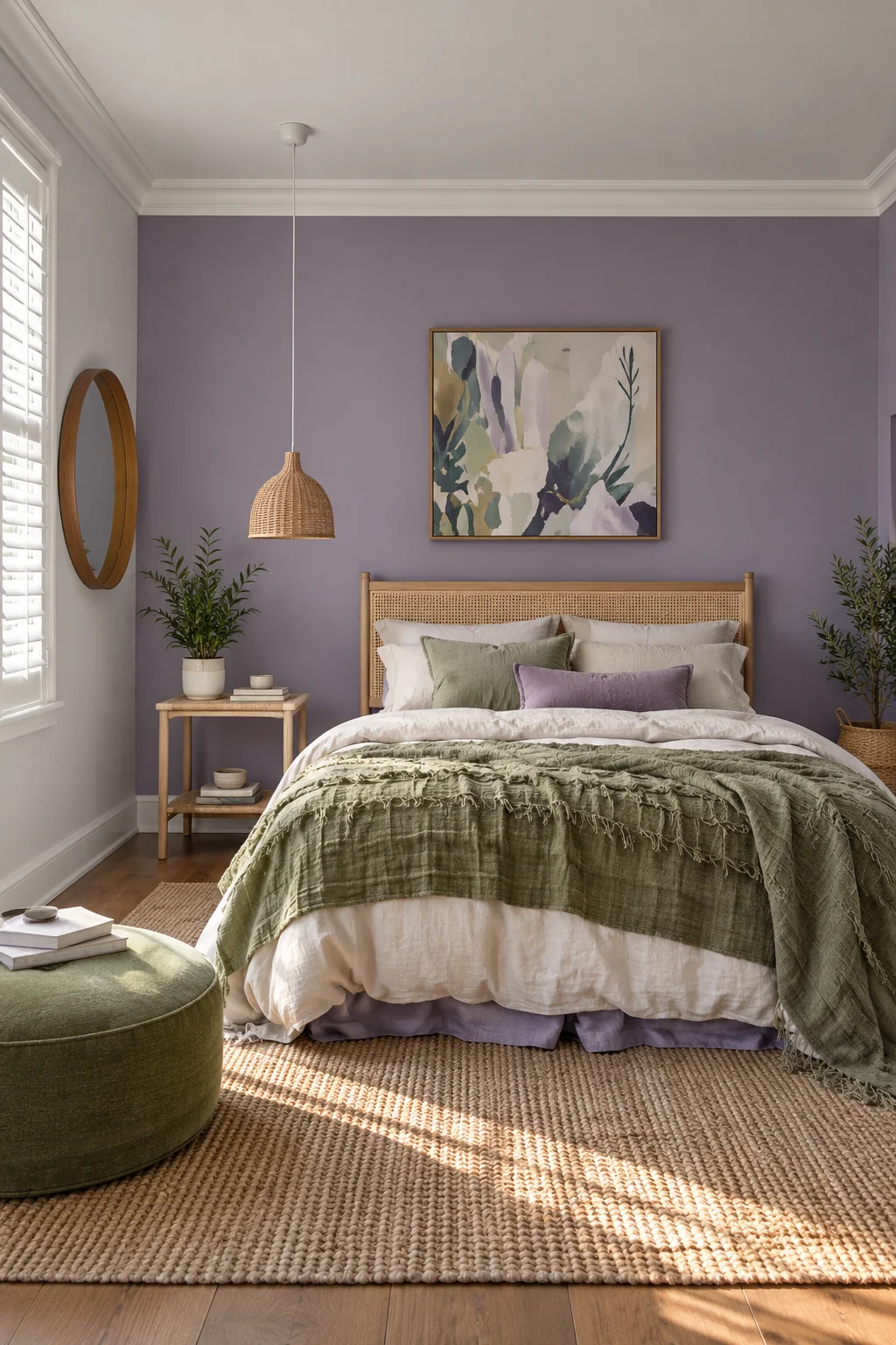
A very soft, gray-toned lavender is a more grown-up take on purple than most people expect, closer to a whisper of color than a true purple wall. Winter Gray by Benjamin Moore is one option in this family, along with similarly muted lavender-gray shades from other paint lines.
Because lavender is a cooler hue, it benefits from warm counterpoints — wood flooring, a warm-toned rug, or brass fixtures — to keep the room from feeling chilly. Paired with dark grays or soft silver tones, this color reads as sophisticated rather than overly sweet.
Brown-Gray for Warmth and Grounding
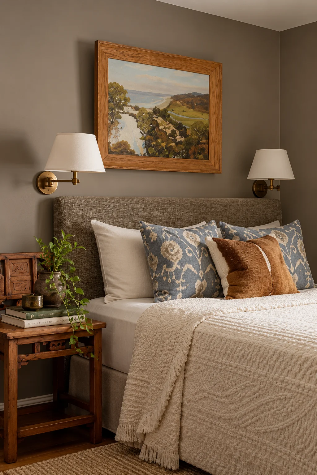
Brown-gray hues sit at the warmest end of the neutral spectrum, making them one of the more reliably cozy choices on this list. Wild Truffle by BEHR is a mid-tone example, a brown-gray that reads as welcoming rather than heavy.
This color pairs well with white trim and blue accents for a more traditional, restful look, or with warm wood and cream textiles for something softer. Because it already leans warm, it’s a safer choice in rooms with limited natural light, where cooler grays can sometimes read as dull instead of calm.
Pale Warm Yellow for Gentle Cheer
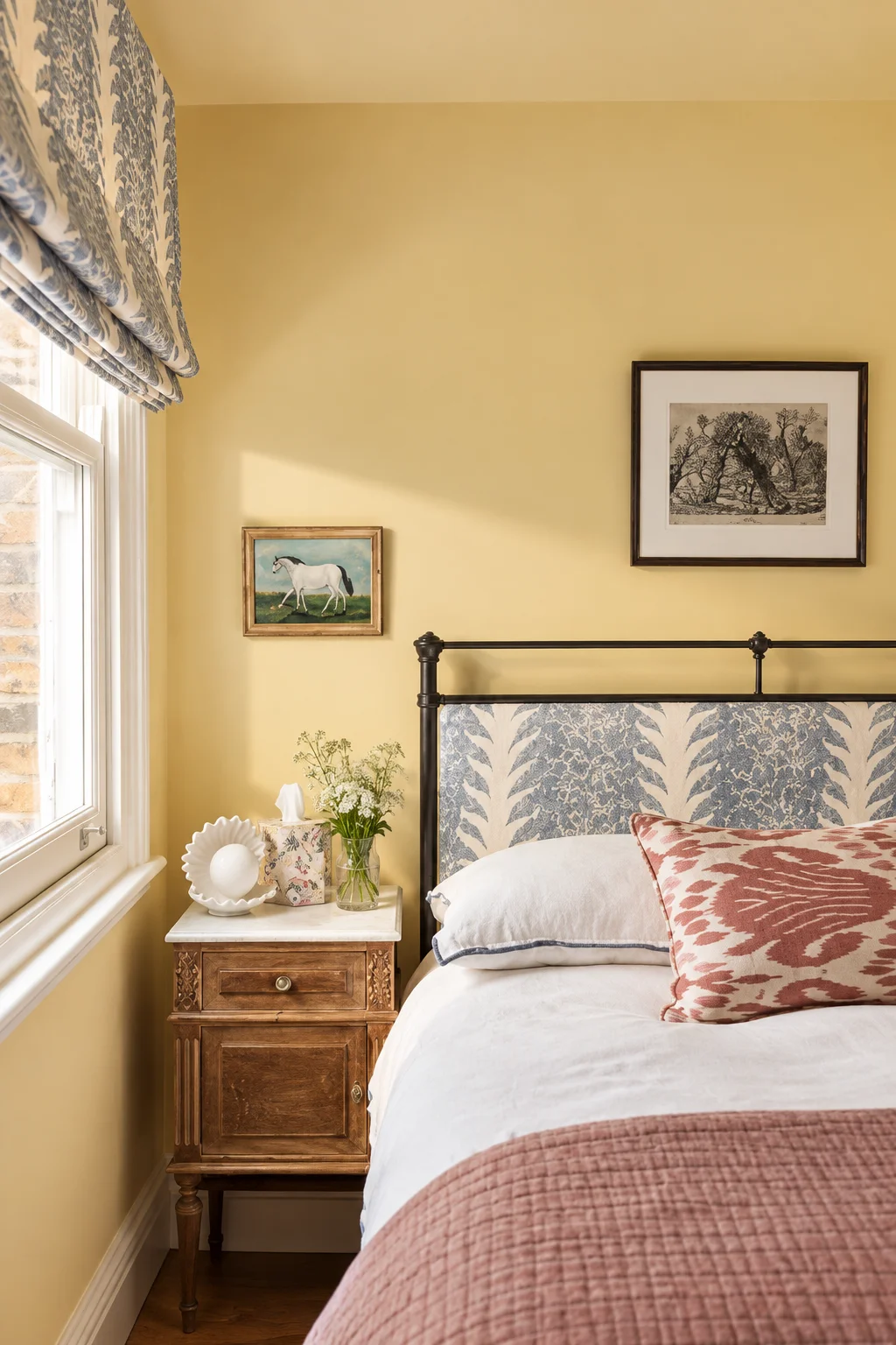
A very soft, warm yellow — closer to early morning light than a bright lemon tone — creates a quiet sense of optimism without the energizing effect of a bolder yellow. It works especially well in bedrooms with little natural light or a north-facing window, where it can offset a room that would otherwise feel dim.
Pairing this color with white, soft gray, and natural wood keeps it from tipping into a nursery-like feel and instead reads as understated warmth. It’s one of the few genuinely cheerful options on this list that still qualifies as calming rather than stimulating.
Dusty Rose for Soft Warmth Without Stimulation
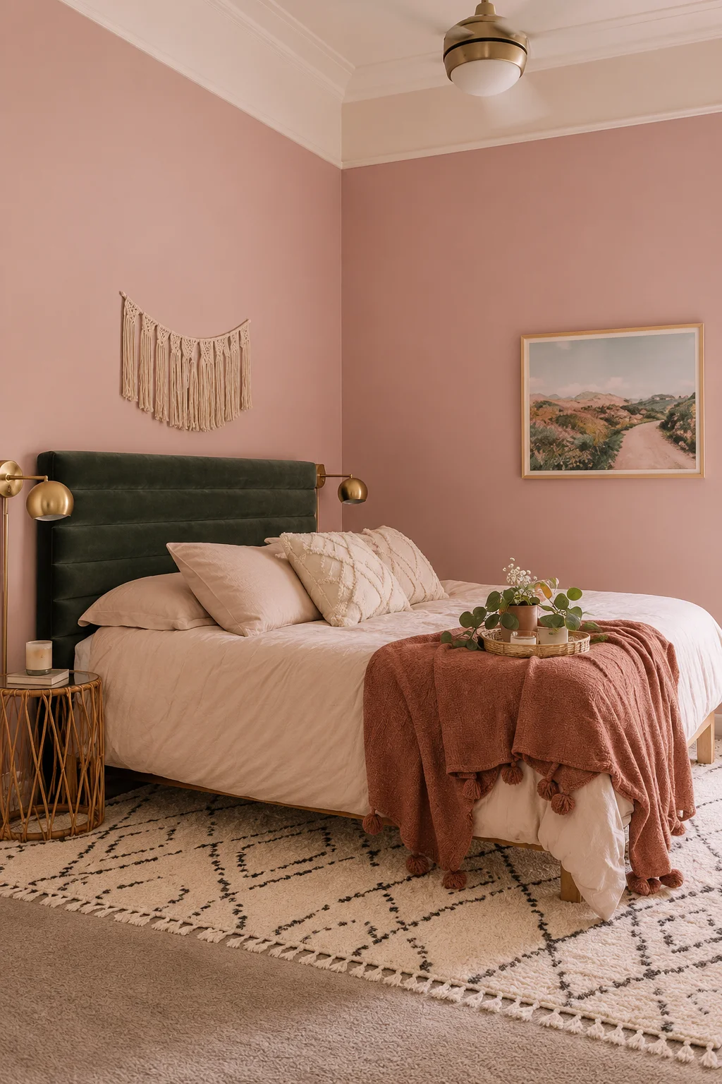
A muted, gray-toned peach or rose avoids the overly sweet look of a brighter pink, instead reading as warm and quietly sophisticated. This version of the color leans on its gray undertone to stay calm rather than playful, which is what separates it from a true pastel pink.
It pairs well with white, soft gray, natural wood, and small touches of coral for a room that feels warm without being loud. This is a good option for anyone who wants a bedroom with a bit more personality than a straight neutral, without losing the restful quality.
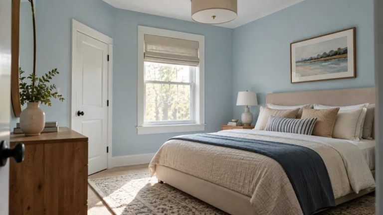
Powder Blue for an Airy, Calm Feel
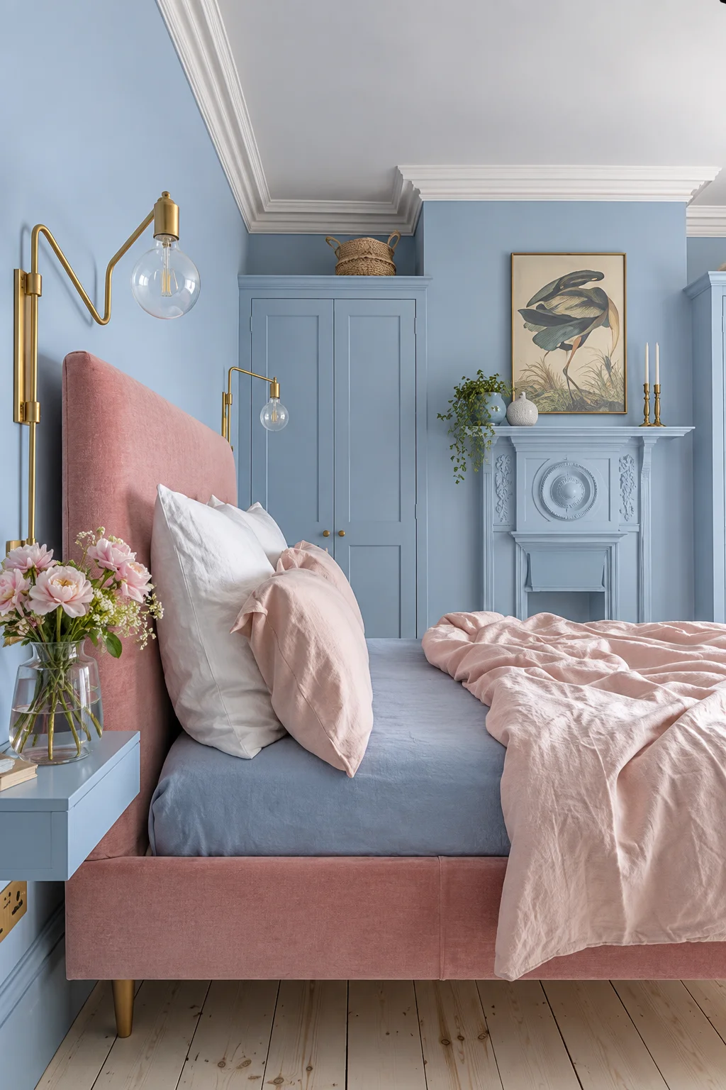
Light, powdery blues — sometimes described as mist or robin’s-egg tones — create a clean, airy feel that’s one of the most classic choices for a peaceful bedroom. Because it’s a cooler hue, it works best in rooms with ample natural light, where it reads as fresh rather than cold.
Pairing powder blue with warm wood floors or a warm-hued rug helps counter the coolness of the color itself, keeping the room from feeling sterile. It’s a dependable option for anyone who wants a classic, unmistakably calming color rather than something more unusual.
Soft Gray-Green for Understated Calm
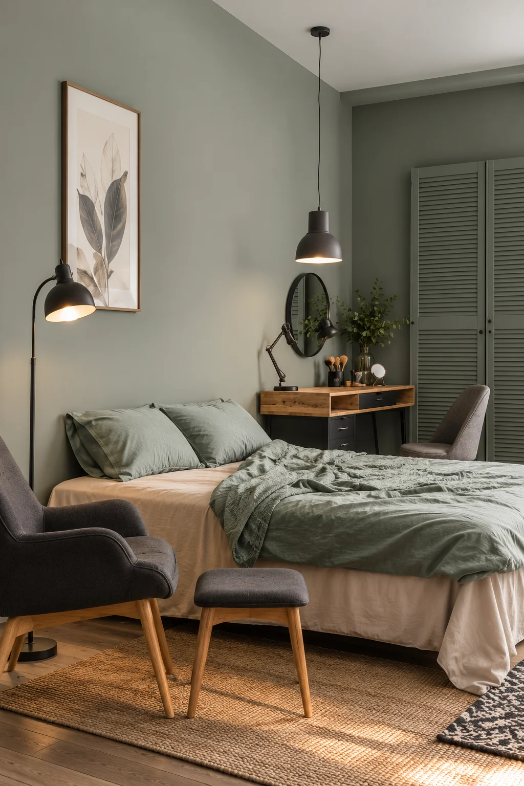
A very light, atmospheric green-gray — a shade like Cromarty from Farrow & Ball is a well-known example — sits in the space between green and gray without leaning fully into either. It’s designed to feel muted and easy to live with, working as a neutral in bedrooms, bathrooms, and living spaces alike.
Because it shifts slightly toward green in some light and gray in other light, it tends to feel more alive than a flat, single-note neutral. It pairs naturally with white trim, black accents, and natural wood for a quiet, layered look.
Warm Taupe for a Quiet, Neutral Backdrop
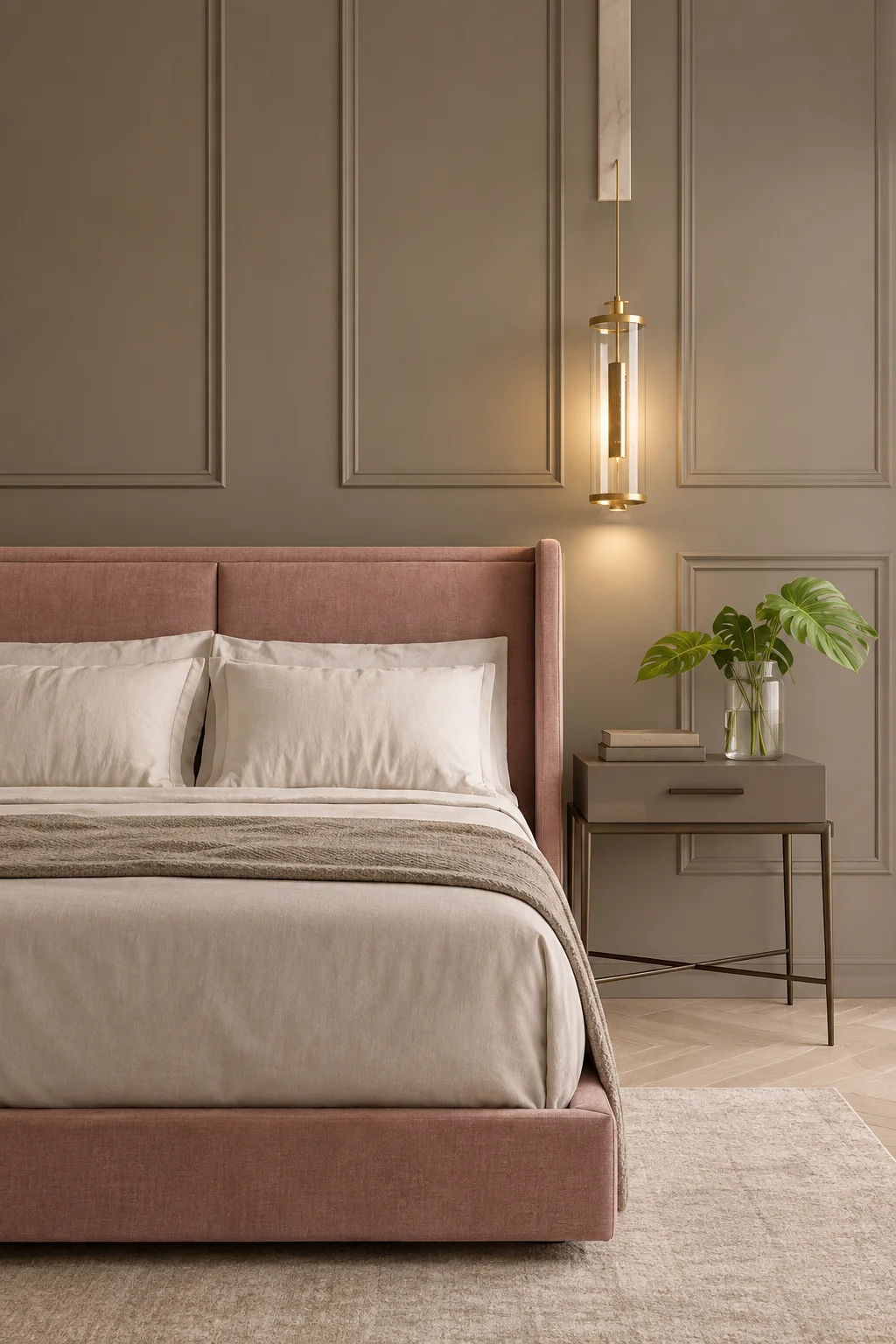
Taupe sits between beige and gray, giving it more warmth than a straight gray without the flatness of a plain beige. It’s one of the safest cozy calm bedroom paint colors on this list, since it adapts easily to almost any furniture style or accent color.
Because it’s so neutral, taupe works well as a long-term choice in bedrooms where the decor is likely to change over the years. It pairs especially well with cream, warm wood, and soft metallics like brushed brass.
Calming Sky Blue for a Peaceful Retreat
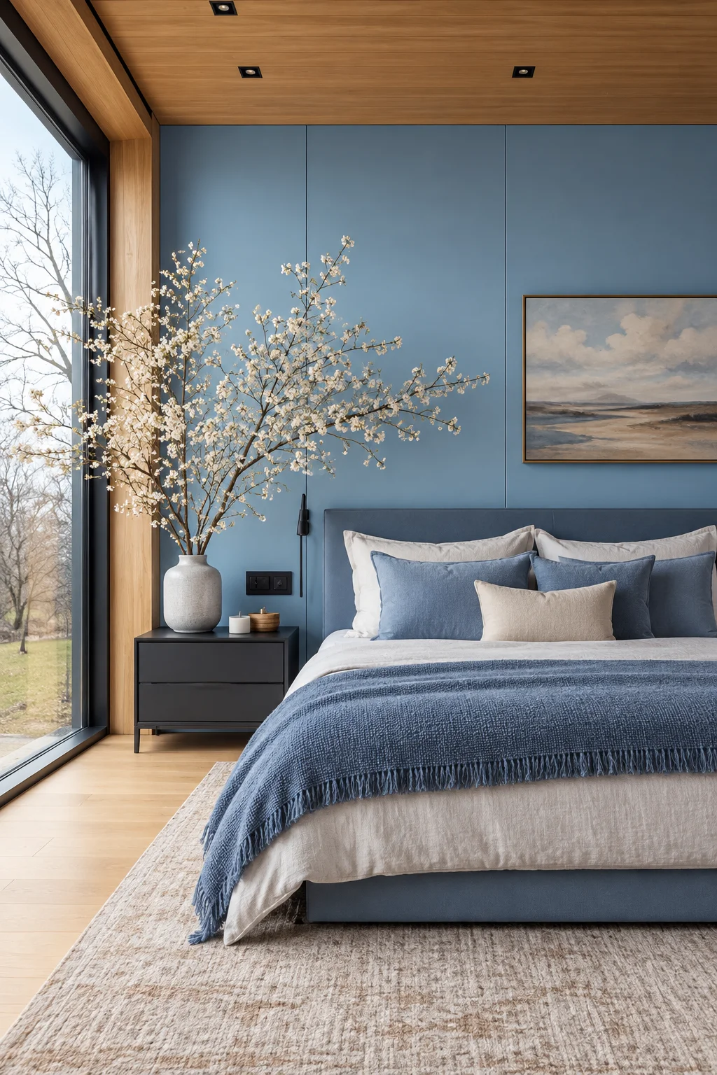
A soft, elegant blue — a shade like Exhale from Benjamin Moore is a well-known example — leans updated and calm rather than nursery-sweet, making it a solid choice for an adult bedroom. It works particularly well in rooms that get consistent natural light throughout the day.
This color pairs well with white bedding, natural wood, and brushed nickel or brass fixtures for a look that feels current without losing warmth. It’s a strong option for anyone who wants a true blue rather than a blue-green or blue-gray hybrid.
Deep Moody Blue for a Cocooning Effect
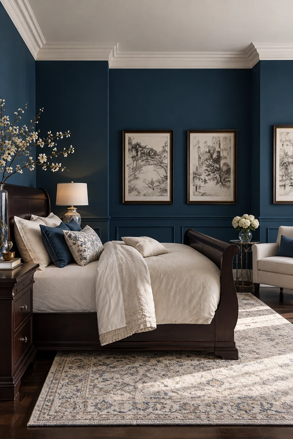
A deep, complex blue-gray — a shade like Inchyra Blue from Farrow & Ball is a well-known example — absorbs a large amount of light, which is what gives it that enveloping, cocoon-like feel rather than a heavy or dark one. It tends to shift slightly toward blue, gray, or even green depending on the light in the room.
This color works best in bedrooms with good natural light or warm lamp lighting in the evening, since low light can make it feel more dim than cozy. Pairing it with bright white trim, warm wood, and soft textiles keeps the depth from feeling overwhelming.
Choosing the Right Paint Sheen for a Calm Bedroom
Sheen affects how calming a color feels just as much as the color itself, since a glossier finish reflects more light and can make even a soft color feel more active than intended. Matte and eggshell finishes absorb light rather than bouncing it, which is part of why they read as more restful on bedroom walls.
Higher-sheen finishes have their place, but they’re generally better suited to trim and doors than to the main wall color in a room meant for rest.
- Matte: softest, most light-absorbing finish, best for a truly calm main wall
- Eggshell: slight sheen, easier to clean than matte, still reads as soft
- Satin: a middle ground, often used in bedrooms with kids for easier upkeep
- Semi-gloss: best reserved for trim, doors, and closets, not the main wall
- Flat ceiling paint: helps a colored ceiling read as enveloping rather than glossy
Common Mistakes When Choosing Cozy Calm Bedroom Paint Colors
The most common mistake isn’t picking the wrong hue — it’s skipping the undertone check and judging a color from a small swatch under store lighting. A color that looks neutral on a paint chip can read distinctly blue, green, or purple once it’s on a full wall in your room’s actual light.
The second most common mistake is assuming “calm” always means light and pale. A well-chosen deep color, balanced with the right trim and textiles, can feel just as restful as a pale one, sometimes more so.
- Skipping a sample on the actual wall before committing to a full room
- Judging color only in daytime light, without checking how it looks at night
- Assuming darker automatically means less calming
- Choosing a trendy color without considering how it pairs with existing furniture
- Painting a small room in a very saturated color without testing it at scale first
How to Test a Paint Color Before You Commit
Paint samples behave differently depending on where they’re applied, so testing on a small square near the closet often gives a misleading result compared to testing on a large, well-lit section of the main wall. A larger swatch gives a more honest sense of how the color will read once it covers the whole room.
Check the sample at multiple times of day, since a color that looks calm at noon can look colder or warmer entirely by lamplight in the evening, which matters more in a bedroom than almost any other room in the house.
- Paint a swatch at least two feet wide, not a small store sample card
- View it in morning light, midday light, and evening lamp light
- Hold it next to your actual bedding and flooring, not just white paper
- Live with the sample for a few days before deciding
- Check how it looks on the wall opposite the window, not just the one it’s facing
Pairing Textiles and Furniture With Your Color Choice
A calming wall color only goes so far if the textiles and furniture around it work against it. Warm wood tones, linen, wool, and brass hardware generally reinforce the cozy feeling of these colors, while glossy, cool-toned materials can undercut it even when the wall color itself is right.
The goal isn’t to match everything exactly, but to keep the overall palette in the same temperature family as the wall, so nothing in the room feels like it’s fighting the calm the paint color is meant to create.
- Layer in natural textures — linen, wool, cotton — to reinforce warmth
- Keep metal finishes consistent (warm brass or matte black, not a mix of both)
- Add a warm-toned rug if the wall color leans cool
- Use white or cream trim to keep deeper wall colors from feeling heavy
- Limit strong accent colors to one or two textiles, not the whole room
FAQ
Soft blues and greens are the most consistently recommended, since both are associated with nature and tend to slow the eye down, but a warm, muted neutral can be just as calming depending on the room’s light.
Either can work — light colors tend to feel airy and calm, while a well-balanced dark color paired with warm textiles and bright trim can feel cozy and cocooning rather than heavy.
Matte or eggshell finishes are generally best for the main wall, since they absorb rather than reflect light, creating a softer, more restful look than higher-sheen finishes.
Warm colors and warm undertones typically read as cozier, though a cool color with warm-toned furniture, lighting, and textiles can still achieve a similarly comfortable feel.
A flat white or a slightly softer tone of the wall color both work well; a glossy ceiling finish tends to work against the calm, enveloping effect most people are going for.
One main wall color paired with a lighter or neutral trim is usually enough; introducing more than two or three colors in a small room can undercut the calming effect.
Yes, especially warmer or greige-leaning grays, which avoid the cold, flat look that cooler grays can create in rooms with limited natural light.
Bright, highly saturated colors and very cool, stark whites tend to work against a calm effect, since both can feel more stimulating or clinical than restful. rather than rubbing, and for jute or sisal, keep them out of consistently damp areas like entryways in humid climates, since these fibers can weaken with repeated moisture exposure.
Love inspiring interiors, practical design ideas, and beautiful spaces? Follow us on Facebook, Instagram, and Pinterest for more interior inspiration, home styling ideas, and everyday design tips.