
Table of Contents
Anyone repainting a bedroom eventually lands on the same question: which pale blue actually works, and which ones look flat, cold, or nothing like the swatch once they’re on the wall. Pale blue paint colors for bedroom walls are popular for a reason — they read as calm without feeling stark, and they sit comfortably between a plain white and a more committed color statement. The tricky part isn’t finding a pale blue; paint decks are full of them. The tricky part is finding the one that suits your room’s light, your existing furniture, and the mood you’re actually going for.
This guide walks through named, real paint options from major brands, how to judge undertone before you buy a gallon, and which bedroom colors pair naturally with pale blue so the room feels finished rather than half-decorated. It also covers the practical side — light direction, room size, trim, and the testing steps that prevent the most common repainting regret: a color that looked perfect on the chip and completely different on the wall.
What Makes a Blue Read as Pale Instead of Icy or Gray
A pale blue is essentially a blue with a high amount of white mixed in, which raises its Light Reflectance Value (LRV) and softens the saturation. That’s different from an icy blue, which keeps more saturation and can read as cooler and more clinical, or a blue-gray, which leans on gray pigment to mute the color down rather than white. Pale blues sit in a middle zone — soft enough to feel gentle, but still identifiably blue rather than a near-neutral.
This distinction matters when you’re comparing paint chips side by side, because “light blue” and “pale blue” get used interchangeably in store displays even though they don’t always describe the same effect. A true pale blue paint color for a bedroom will still show its blue undertone clearly in daylight, while a heavily grayed-down version can shift toward looking like a plain gray on cloudy days. Knowing which effect you want before you shop narrows the options considerably.
How Pale Blue Bedroom Colors Affect Mood and Rest
Blue is one of the most consistently recommended bedroom colors in interior design and sleep-focused research, largely because it’s associated with calm rather than stimulation. Unlike warmer, more saturated colors that tend to energize a room, pale blue bedroom colors generally read as restful because they echo natural, low-arousal references like sky and water. That’s part of why pale blue continues to top so many “best bedroom colors” recommendations rather than falling out of favor as a trend.
That said, the calming effect isn’t just about the hue in isolation — it’s also about how muted and how light the shade is. A very saturated or dark blue can start to feel moody or enclosing rather than soothing, which is why most guidance points specifically toward the paler, softer end of the blue family for a bedroom rather than a bold navy or teal. The goal is a color that recedes into the background of the room instead of demanding attention every time you walk in.
- Reads as calm rather than energizing, unlike warm saturated colors
- Echoes natural, low-arousal references like sky and open water
- Works as a background color that doesn’t compete with furniture or art
- Tends to feel less “trend-dated” than more saturated accent colors
- Pairs easily with most existing bedroom colors, so it rarely requires a full re-decorate
Best Pale Blue Paint Shades to Consider
Rather than guessing at a generic “light blue,” it helps to start from specific, named shades that designers and paint brands actually use in bedrooms. From Benjamin Moore, Woodlawn Blue HC-147 leans toward a soft, grayed blue with a touch of green, while Ocean Air 2123-50 and Winter Lake read cleaner and cooler with more gray undertone. From Sherwin-Williams, Rainwashed and Sea Salt are technically blue-greens but are frequently used where a pale blue bedroom color is wanted, and Krypton skews more clearly blue-gray if you want less green in the mix.
If you’re drawn to designer paint lines, Farrow & Ball’s Borrowed Light is a pale, light-reflecting sky blue often recommended for rooms that don’t get much natural sun, while Pale Powder reads as a soft duck-egg blue with more depth. Little Greene’s Bone China Blue Pale is a quieter, more subdued option for anyone who wants blue without much saturation at all. None of these shades will look identical in your specific room — lighting changes everything — but they’re a reliable starting point for ordering samples rather than scrolling through hundreds of chips with no direction.
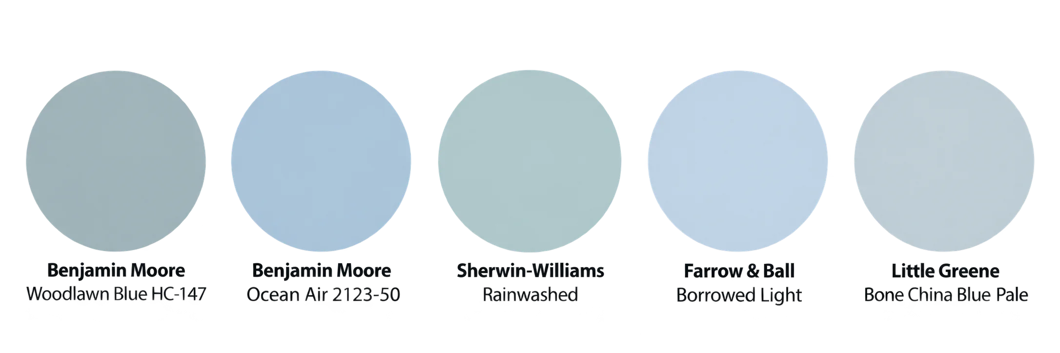
- Benjamin Moore Woodlawn Blue HC-147 — soft, grayed blue with a hint of green
- Benjamin Moore Ocean Air 2123-50 — cleaner, cooler pale blue
- Sherwin-Williams Rainwashed — pale blue-green, softer and more coastal
- Farrow & Ball Borrowed Light — pale sky blue that bounces light well
- Little Greene Bone China Blue Pale — subdued, low-saturation blue
Bedroom Colors That Pair Well With Pale Blue
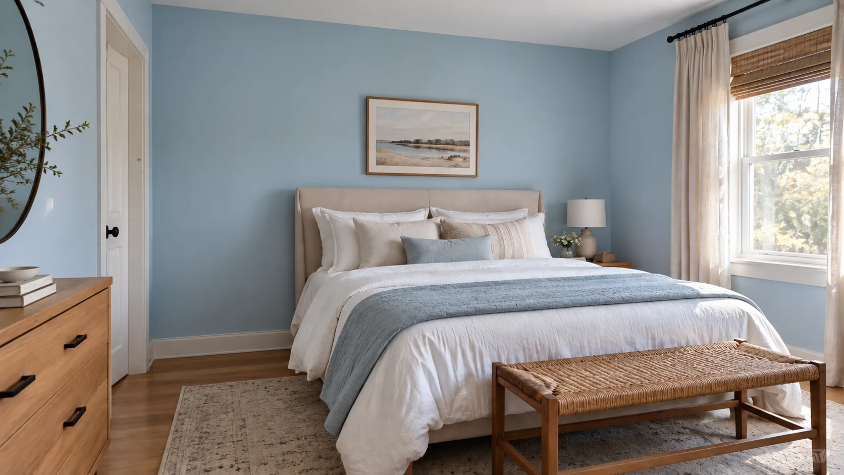
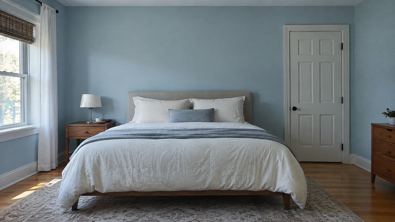
Pale blue paint colors for bedroom rarely works alone as the only color decision in a room — it needs supporting bedroom colors to feel finished rather than sparse. Soft white and warm cream are the most dependable partners, particularly on trim and ceilings, because they keep the room feeling bright without introducing a competing hue. Natural wood tones also pair easily with pale blue, since the warmth of the wood balances the coolness of the paint and keeps the room from feeling one-note.
For anyone who wants more depth than white-and-wood alone, warm neutral bedroom colors like taupe or soft greige work well in bedding and rugs without fighting the wall color, and a small amount of sage or muted green can echo the same natural, low-saturation feeling that makes pale blue calming in the first place. Brass or warm-toned metal fixtures — lamps, drawer pulls, curtain rods — add a bit of warmth and prevent the room from leaning entirely cool.
- Soft white or warm cream for trim, ceilings, and larger furniture pieces
- Natural wood tones in flooring, headboards, or nightstands
- Warm taupe or greige bedding and rugs for added depth
- Sage or muted green accents for a natural, layered palette
- Brass or warm metal fixtures to offset the coolness of the blue
Choosing the Right Pale Blue for Your Room’s Natural Light
The single biggest reason a pale blue paint color looks different at home than it did on the sample chip is light direction. The same can labeled “pale blue” can read soft and warm in one room and noticeably cooler or grayer in another, purely based on how much and what kind of natural light the room receives throughout the day. This is worth sorting out before you buy a full gallon, not after.
Artificial lighting matters too, particularly since bedrooms are used heavily in the evening. Warm-toned bulbs (lower Kelvin, generally 2700K–3000K) tend to soften pale blue and pull out any warmer undertones, while cooler, bluer-toned bulbs can make the same wall color look flatter or more clinical after dark. If your bedroom relies mostly on lamp light in the evening, it’s worth testing your shortlisted color under your actual bulbs, not just in daylight.
North-Facing Bedrooms
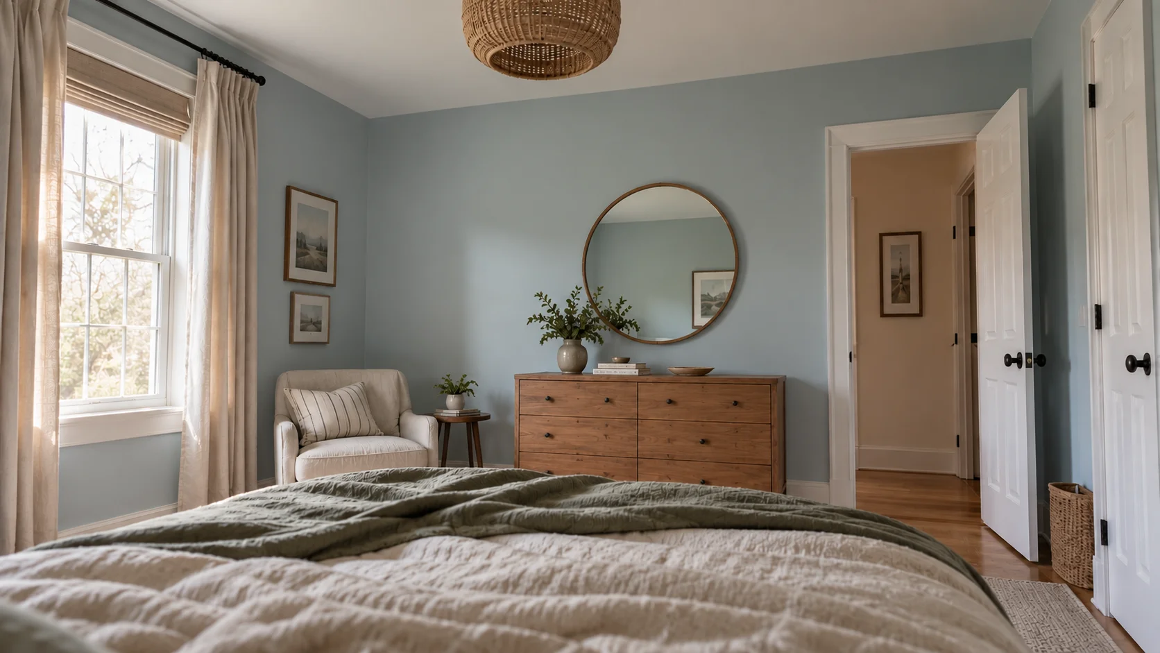
North-facing rooms get consistent but indirect, cooler light throughout the day, which tends to bring out the coolest, grayest undertones in any blue. A pale blue that looks balanced in a sunnier room can read noticeably flatter or more muted in a north-facing bedroom, so it’s often worth choosing a shade with a slightly warmer undertone — one with a touch of green or gray-green rather than a crisp, clean blue — to avoid the room feeling dim.
If you’re set on a cooler, crisper pale blue despite the light direction, balancing it with warm bedroom colors elsewhere in the room — wood tones, warm white trim, brass fixtures — can offset some of that coolness without changing the paint itself. It’s a smaller adjustment than repainting, and it tends to be enough to keep the room from feeling cold.
South and West-Facing Bedrooms
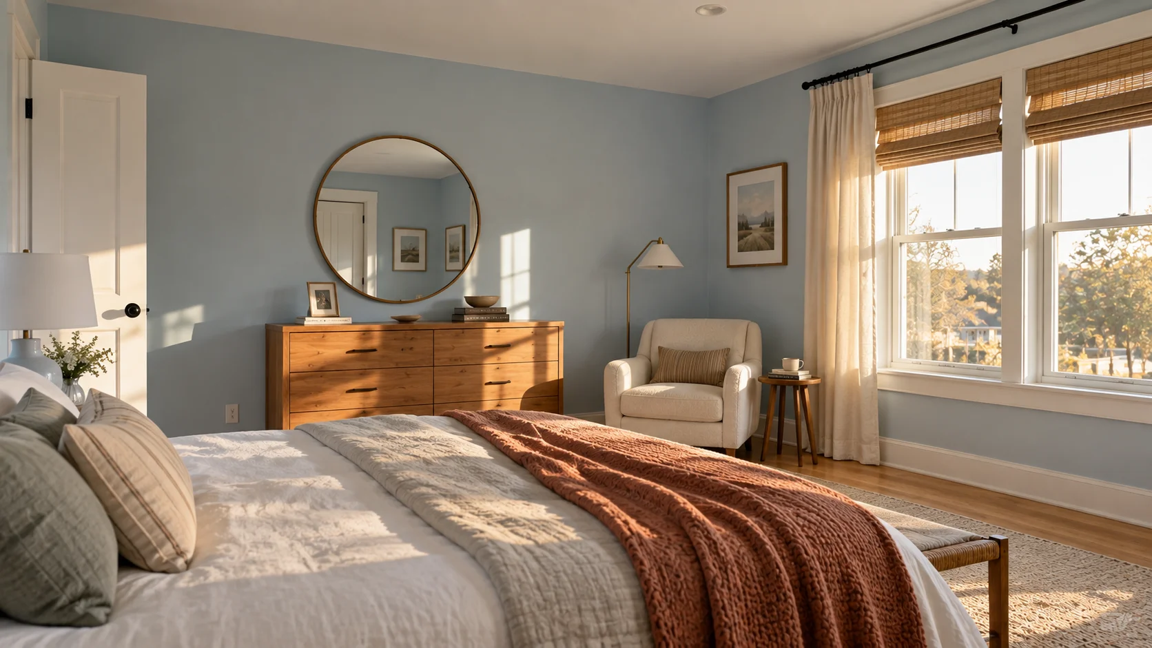
South- and west-facing bedrooms get more direct, warmer light for more of the day, which generally makes pale blue paint colors look brighter, cleaner, and truer to their undertone. These rooms have more flexibility — a crisper, more saturated pale blue that might feel too cool in a north-facing room often reads as fresh and balanced here instead.
The one thing to watch for in these rooms is the opposite problem: strong afternoon sun can wash out a very pale shade, making it look almost white for part of the day. If that’s a concern, sampling a shade one step deeper than you think you need is a reasonable way to make sure the color still reads clearly once the light is at its brightest.
Pale Blue Bedroom Colors in Small Rooms
In a small bedroom, pale blue tends to work in the room’s favor rather than against it, because lighter, less saturated colors generally read as more spacious than dark or highly saturated ones. A pale blue with a higher LRV keeps the walls from visually closing in, which matters more in a small room where every surface is close to the eye.
Keeping the color consistent across walls, trim, and ceiling — rather than introducing a contrasting white ceiling or dark accent wall — usually reinforces that sense of space further, since it removes the visual “stopping points” that can make a small room feel chopped up. If you do want contrast, doing it through bedding, art, or a single piece of furniture tends to work better in a small bedroom than doing it through the wall paint itself.
Undertones to Watch for When Testing Pale Blue Paint
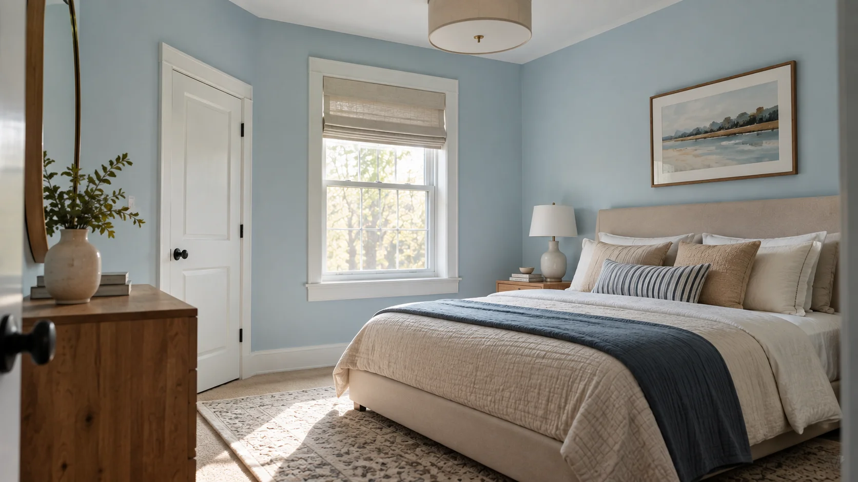
Every pale blue paint color carries a secondary undertone, even when it looks like “just blue” on the chip — usually gray, green, or occasionally a faint violet. That undertone is what determines whether the color leans coastal and soft, more historic and muted, or slightly cooler and more modern, and it’s often invisible until the paint is actually on a wall in your specific lighting. This is the single most common source of disappointment when a color looks different at home than it did in the store.
The most reliable way to catch this before committing is to paint a large sample directly on the wall — not just a small swatch — and view it at different times of day, including in the evening under your usual lighting. Comparing it against your existing floors, trim, and any large furniture pieces in the room also helps reveal whether the undertone clashes with anything already in the space.
- Paint a large sample (at least a 2-by-2-foot area), not a small card-sized swatch
- Check the color in morning, midday, and evening light
- View it under your actual bedroom light bulbs after dark
- Hold the sample next to existing wood floors, trim, and furniture
- Compare two or three shortlisted shades side by side rather than one at a time
Finishes and Trim: Getting the Full Look Right
Finish affects how a pale blue paint color reads almost as much as the shade itself. A flat or matte finish tends to soften the color and hide small wall imperfections, which suits the relaxed, low-key look most people want from a pale blue bedroom. Eggshell or satin finishes add a little more durability and a slight sheen, which can be useful in a bedroom that also functions as a home office or gets more daily wear.
Trim color is worth deciding alongside the wall color rather than as an afterthought. A crisp white trim creates clean contrast and keeps the room feeling fresh, while trim painted the same pale blue — or a slightly lighter version of it — creates a softer, more enveloping look with less visual break between wall and woodwork. Neither is more “correct”; it depends on whether you want the room to feel crisp and defined or soft and cohesive.
Common Mistakes When Choosing Pale Blue Bedroom Colors
The most common mistake is choosing a color from a small paint chip or a photo on a screen and skipping the on-wall sample step entirely. Screens and small chips can’t account for your room’s specific light, and a shade that looked ideal in a photo can look noticeably different once it’s actually on your walls. The second most common issue is testing a color only during the day and being surprised by how it looks at night under lamp or overhead light.
Beyond testing, people often underestimate how much existing bedroom colors — flooring, trim, large furniture — will interact with a new pale blue. A shade that would look perfect against white oak floors can look slightly off against darker wood, and stark white trim can occasionally make a soft blue look colder than intended. Considering the room as a whole, rather than the wall color in isolation, avoids most of these surprises.
- Choosing a color from a screen or a small chip without an on-wall sample
- Only testing the color during the day and skipping evening lighting
- Ignoring how existing wood tones or trim will interact with the new color
- Assuming all “pale blue” shades from different brands will look the same
- Painting an entire room before confirming the undertone in your specific light
How to Test and Sample Pale Blue Before You Commit
Once you’ve shortlisted two or three shades, the most effective test is a large painted sample directly on the wall, ideally in more than one spot in the room, since light can vary even within a single space. Let the sample fully dry and cure before judging it, since wet paint often looks darker and more saturated than the finished result.
Give yourself at least a full day-and-night cycle with the sample up before deciding, so you can see how the color behaves in morning light, midday light, and evening lamp light. It’s a small extra step compared to repainting an entire bedroom that turns out to be the wrong shade, and it’s the difference between a pale blue that looks intentional in your specific room and one that just looked good in the store.
FAQ
There isn’t a single universal answer, since the right shade depends on your room’s light direction and existing bedroom colors. In general, softer, higher-LRV pale blues with a slight gray or green undertone — such as those used in coastal or transitional bedroom design — tend to work in the widest range of rooms.
Blue is one of the most consistently recommended bedroom colors for a calming atmosphere, largely because it’s associated with rest rather than stimulation. Paint color alone won’t guarantee better sleep, but a softer, less saturated color is generally considered easier to relax in than a bright, high-energy hue.
Soft white, warm cream, and natural wood tones are the most dependable pairings. Warm neutrals like taupe, a touch of sage green, and brass or warm metal fixtures also work well if you want the room to feel a little warmer and more layered.
It can be, particularly in a north-facing room with limited natural light or paired with stark white trim. Choosing a pale blue with a warmer undertone, or balancing it with wood tones and warm accents, usually resolves this.
Pale blue tends to feel more spacious and versatile, especially in smaller rooms, while darker blues create a cozier, more enclosed feeling that works better in larger bedrooms with good natural light. Neither is inherently better — it depends on the room and the mood you want.
Most pale blues lean toward gray, green, or occasionally violet. Testing a large sample on your actual wall is the most reliable way to see which undertone is present, since it’s often not obvious from a small paint chip.
Yes — lighter, less saturated colors like pale blue generally make a small room feel more open than dark or highly saturated colors. Keeping the color consistent across walls, trim, and ceiling tends to reinforce that sense of space.
Crisp white trim creates a clean, fresh contrast, while trim painted the same pale blue (or a lighter version of it) creates a softer, more cohesive look with less visual break between the wall and woodwork.
Love inspiring interiors, practical design ideas, and beautiful spaces? Follow us on Facebook, Instagram, and Pinterest for more interior inspiration, home styling ideas, and everyday design tips.