
Table of Contents
Top 10 Bedroom Colors at a Glance
Picking a bedroom color usually comes down to one question: do you want the room to calm you down or wake you up a little when you walk in? Most homeowners land on the first answer, which is why cool, muted tones dominate every list of the top 10 bedroom colors, while brighter, high-energy shades stay reserved for rooms you don’t sleep in. The color on your walls isn’t just decoration — it’s one of the few design choices that has a measurable effect on how quickly you unwind at night and how alert you feel come morning.
Below are the top 10 bedroom colors homeowners and designers keep coming back to, along with what each one does to the mood of a room and who it tends to suit best.
- Soft blue
- Sage green
- Warm greige
- Off-white
- Dusty rose
- Muted lavender
- Deep navy
- Warm gray
- Soft yellow
- Terracotta and clay
1. Soft Blue
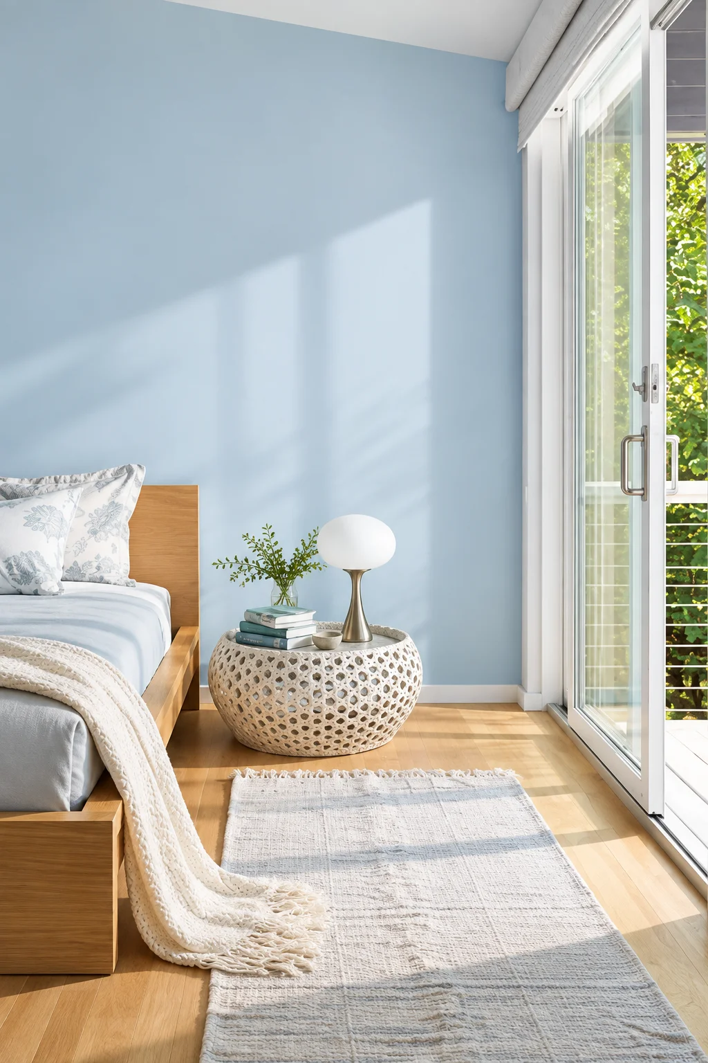
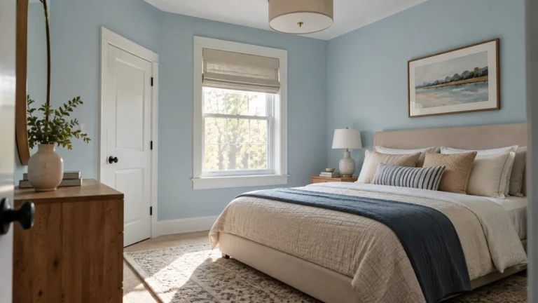
Soft blue consistently tops lists of the best bedroom colors, and it’s not just a design trend — cool colors like blue lower physiological arousal, which is the opposite of what you want happening in a room built for sleep. It reads as calm and orderly without feeling cold, which is why it works in bedrooms with almost any style, from coastal to modern minimalist.
The shade matters more than the color family here. A dusty, slightly grayed-down blue feels grounded and warm at night, while a bright, saturated blue can start to feel chilly under artificial light. Pair it with warm wood tones, linen bedding, or brass fixtures to keep the room from tipping into cold territory.
2. Sage Green
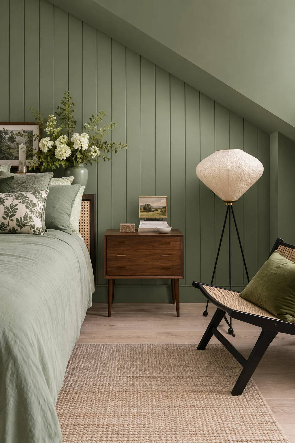
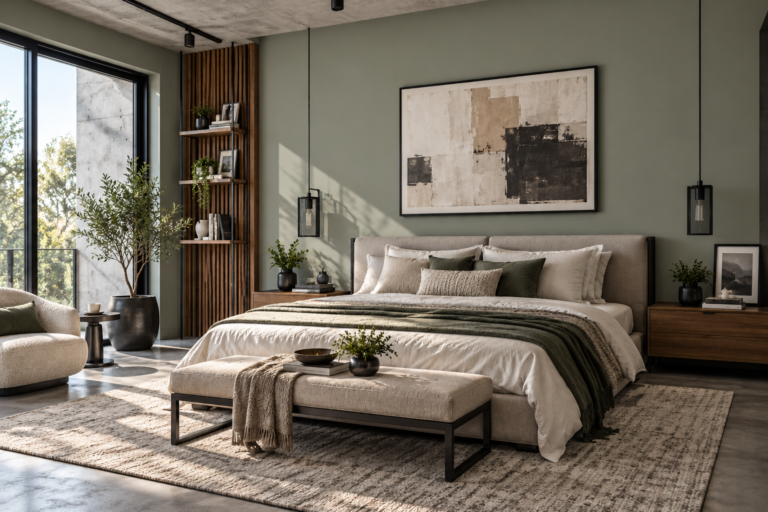
Sage green earns its spot among the top 10 bedroom colors because it borrows directly from the outdoors — a color association that consistently reads as restorative rather than energizing. It’s muted enough to work as a full accent wall or the entire room without overwhelming the space, which is part of why it’s shown up so heavily in recent bedroom color trends.
Sage pairs naturally with warm neutrals, rattan, and light wood, which keeps the room from feeling too cool or clinical. It also tends to photograph and read well in both north- and south-facing rooms, making it a safer pick than some of the trickier greens that shift dramatically with light.
3. Warm Greige
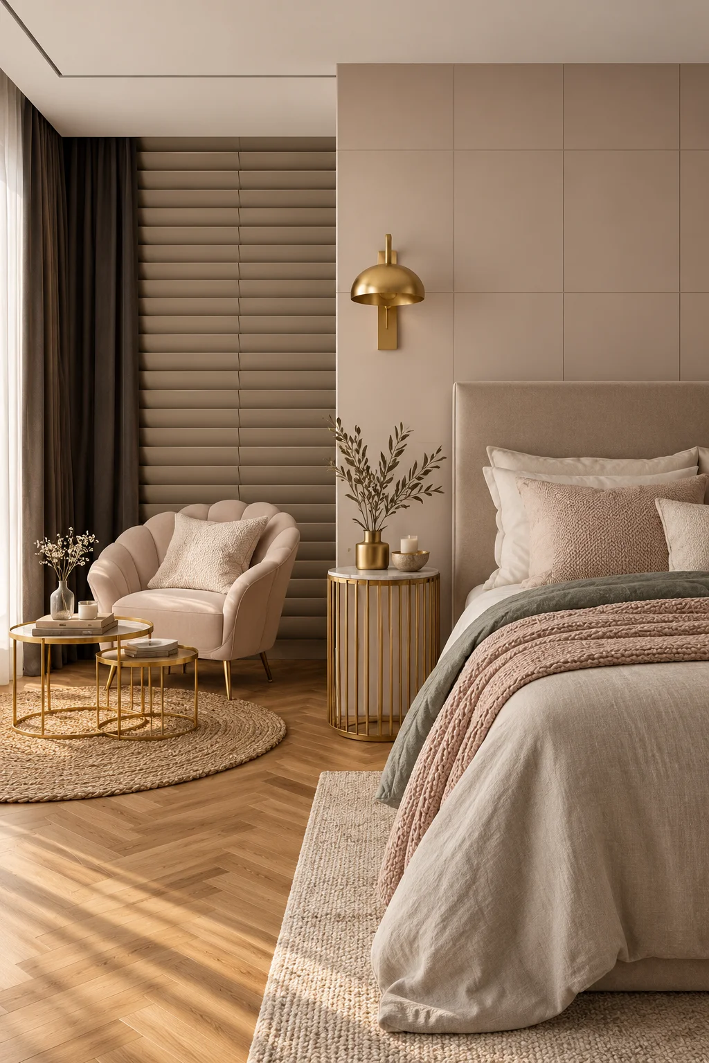
Warm greige sits in the space between beige and gray, and it’s become a go-to for people who want a neutral bedroom without the flatness that plain white or pure gray can bring. It’s flexible enough to work as a backdrop for bold bedding or art, which makes it a practical choice if you like to change your decor seasonally.
The “warm” part of warm greige is doing a lot of work — undertones matter here more than in almost any other color on this list, since a greige with cool undertones can read gray and sterile, while a warm greige feels soft and enveloping. Testing a sample on your actual wall, in your actual lighting, before committing to a full room is worth the extra day it takes.
4. Off-White
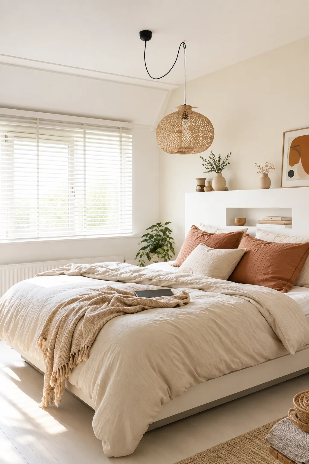
Off-white remains one of the most dependable choices among the top 10 bedroom colors, largely because it does what stark white can’t: it feels warm rather than sterile, and it reflects light without bouncing it harshly around the room. Small bedrooms in particular benefit from off-white, since it makes tight quarters feel more open.
The trade-off is that off-white can feel flat on its own, so it tends to work best layered with texture — a woven headboard, linen curtains, a wool rug — rather than left as a single flat plane of color. Without that layering, the room can start to feel unfinished rather than calm.
5. Dusty Rose
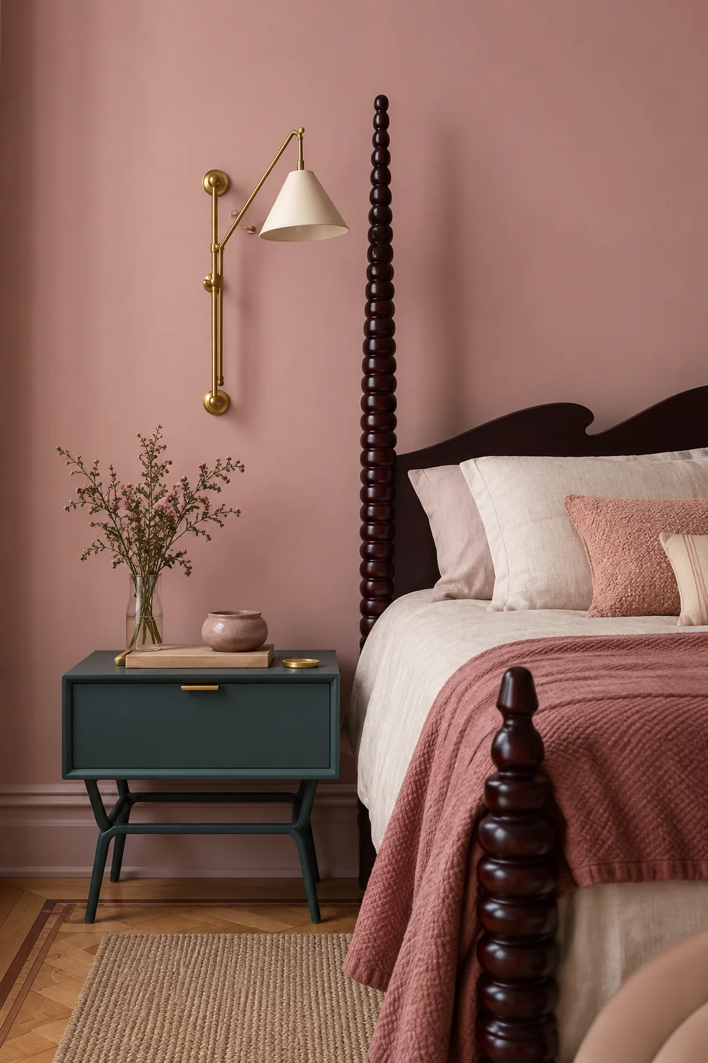
Dusty rose has moved well past its “feminine only” reputation and now shows up regularly in gender-neutral bedroom palettes. Muted pink tones read as soft and peaceful rather than saccharine, especially when the shade leans more toward clay or mauve than bubblegum.
Balance is the key with dusty rose. Pairing it with warm neutrals, black accents, or brushed metal keeps the room feeling grounded instead of overly sweet, and it prevents the color from reading as a “kid’s room” choice by accident.
6. Muted Lavender
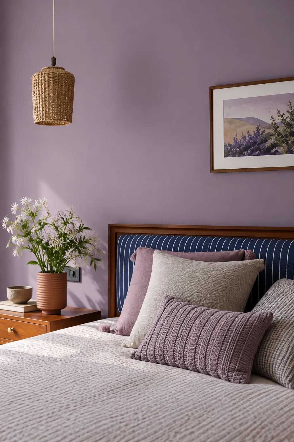
Lavender is a nuanced pick among bedroom colors — it carries genuine calming associations, but only in its softer, grayed-down forms. A bright or saturated purple can tip into the same overstimulating territory as red, which defeats the purpose of choosing it for a bedroom in the first place.
Kept pale and muted, lavender pairs well with grays, whites, and warm wood, and it tends to suit people who want a room that feels a little more distinctive than the standard blue-or-green routes without sacrificing a restful mood.
7. Deep Navy
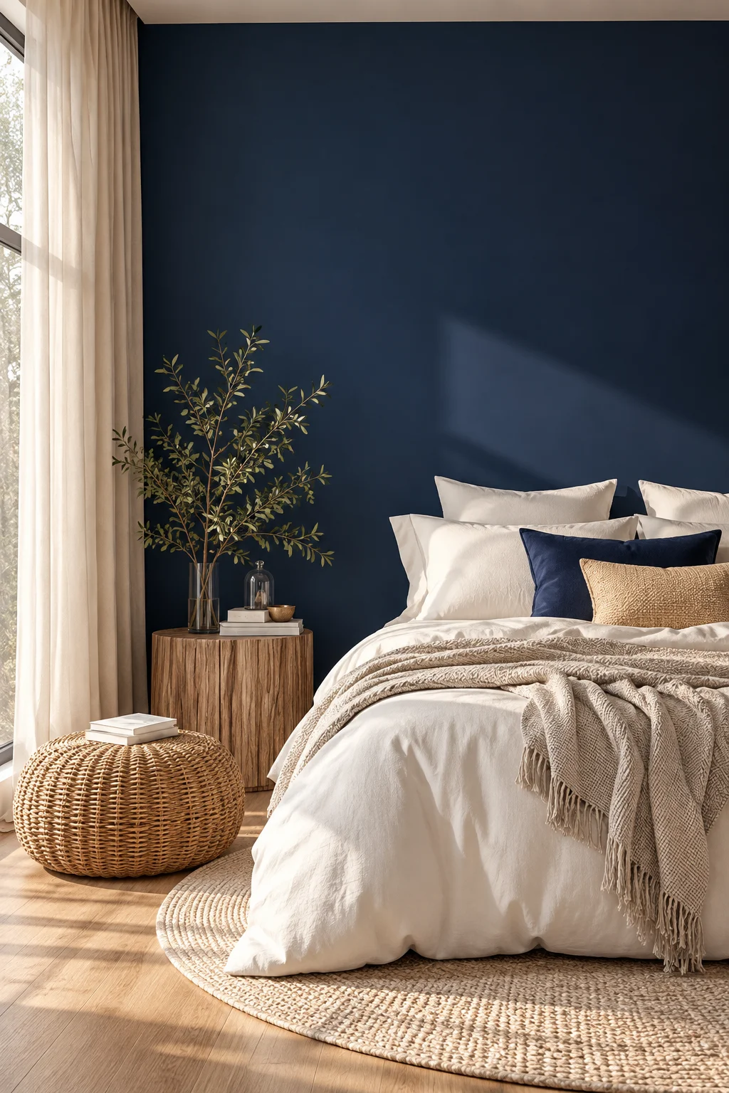
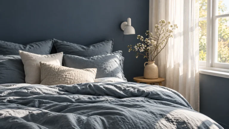
Deep navy is the boldest entry on most lists of the top 10 bedroom colors, and it works precisely because darkness itself can feel cocooning rather than oppressive when it’s used intentionally. A rich navy wall, especially paired with crisp white trim or warm brass lighting, reads as sophisticated rather than heavy.
Navy is best used with some restraint — a single accent wall, or navy paired with lighter ceilings and floors, keeps the room from feeling closed in. Smaller rooms with limited natural light are the ones where this color needs the most care.
8. Warm Gray
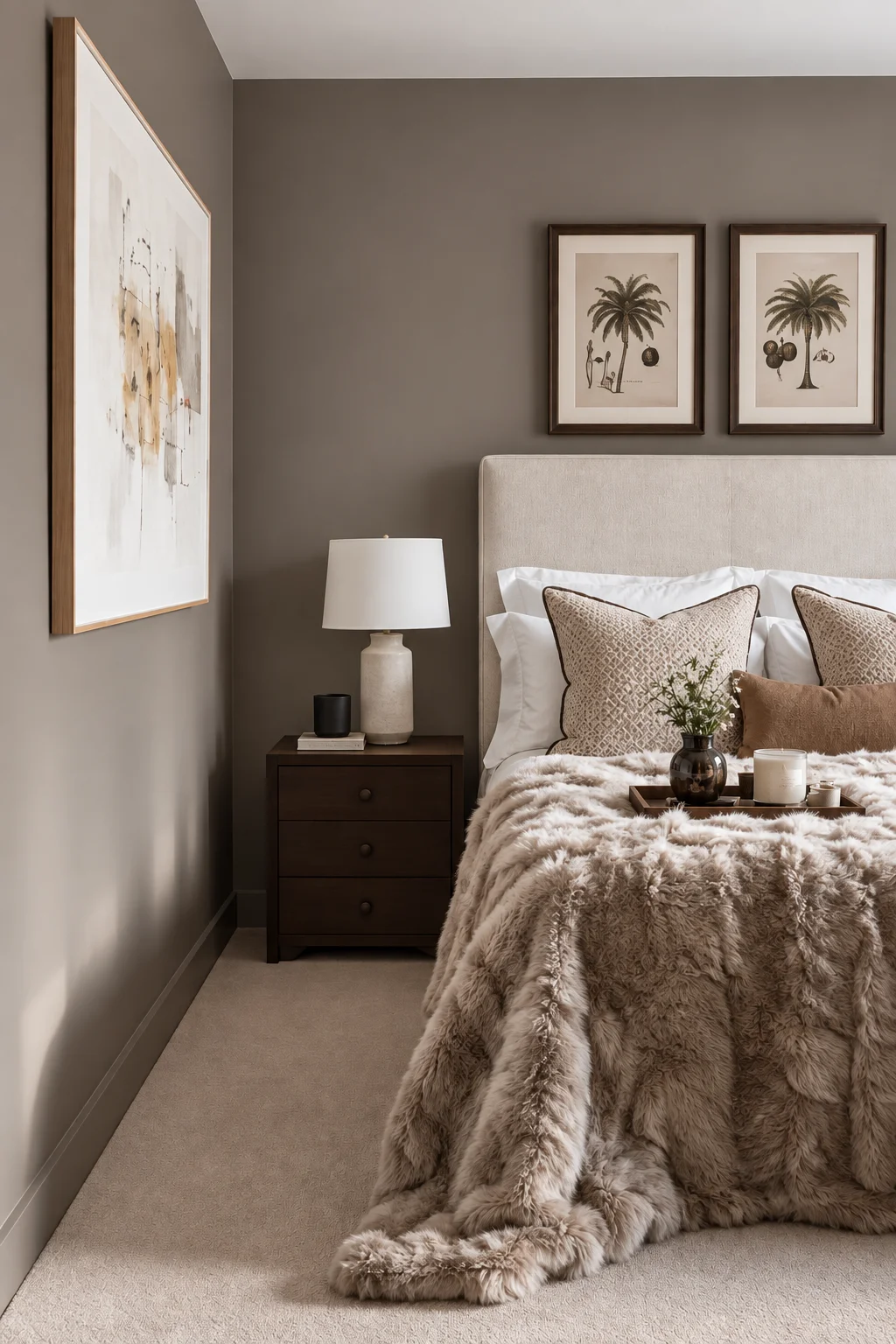
Warm gray splits the difference between the softness of greige and the crispness of a true neutral, and it’s a favorite for bedrooms that need to coordinate with a lot of existing furniture or bedding. It stays quiet enough to not compete with anything else in the room.
The risk with gray is going too cool, which can leave a bedroom feeling sterile instead of restful. Sticking to grays with visible warm undertones, and testing them against your actual flooring and trim, helps avoid that outcome.
9. Soft Yellow
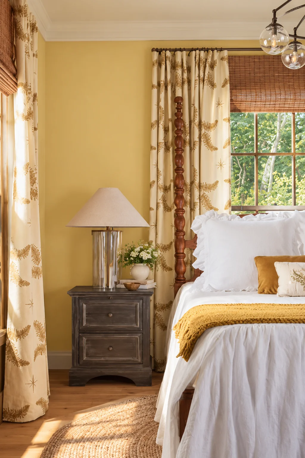
Soft, pale yellow is one of the few warm colors that still shows up on best-bedroom-color lists, largely because in its muted forms it reads as gentle and cheerful rather than stimulating. It works particularly well in rooms that don’t get much natural light, since it can make a dim space feel sunnier without needing saturated color.
The line between “soft yellow” and “bright yellow” is a thin one, and crossing it changes the entire feel of a room. Sticking to pale, almost buttery shades — rather than anything close to a true bright yellow — keeps the color in calming territory.
10. Terracotta and Clay
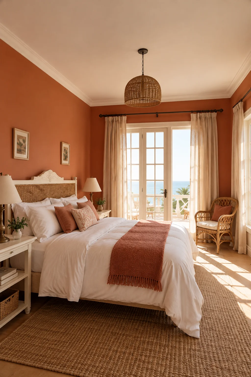
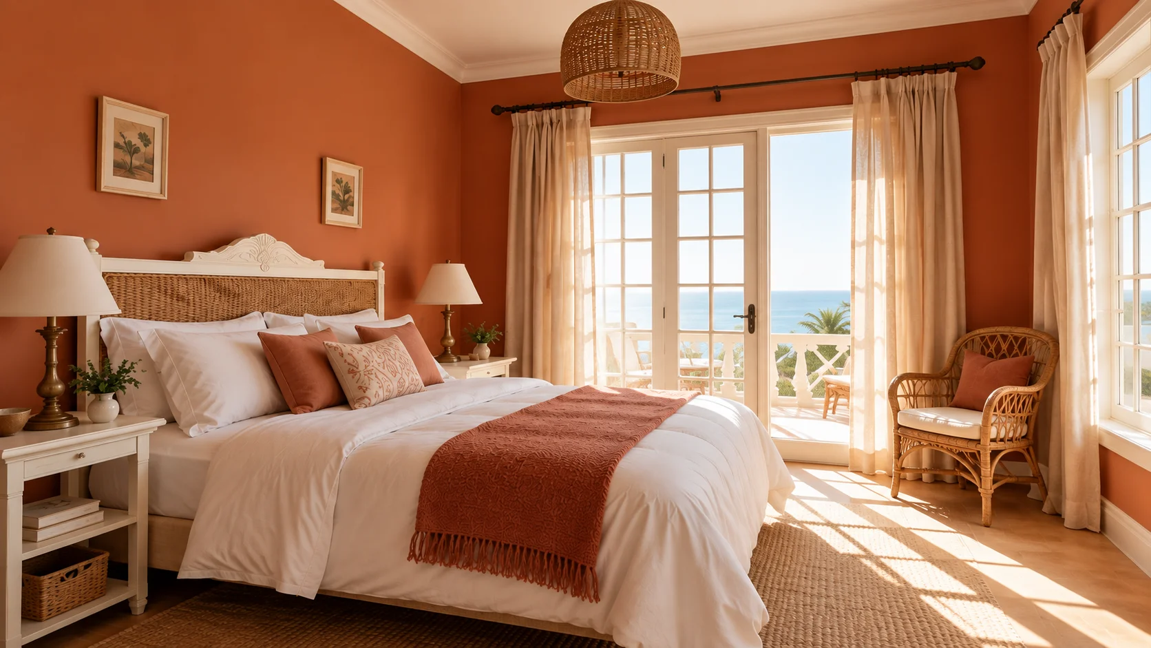
Terracotta and clay tones round out the top 10 bedroom colors for homeowners who want warmth and personality without going as bold as navy or as saturated as red. These earthy, muted oranges read as grounded rather than energizing, largely because they’re closer to natural clay and stone than to a bright, primary orange.
They pair especially well with warm woods, linen, and greenery, and they tend to suit bedrooms with a lot of natural light, where the warmth of the color has room to feel cozy rather than heavy. In darker rooms, these tones can start to feel dense, so they’re worth testing before committing to a full wall.
How to Choose the Right Bedroom Color for Your Space
With ten solid options on the table, the harder part is usually narrowing them down to the one that will actually work in your room. Natural light, room size, and how the space is used — is it purely for sleep, or also a home office or reading nook — all shape which of these colors will feel right day to day rather than just in a photo.
A few practical factors are worth weighing before you commit to any single shade:
- How much natural light the room gets, and whether it’s north-facing (cooler light) or south-facing (warmer light)
- The size of the room, since darker and more saturated colors read heavier in smaller spaces
- What’s staying the same — flooring, trim, existing furniture — that the new color needs to work with
- Whether the bedroom is used only for sleep or also for other activities during the day
- Your own sensitivity to color intensity, since some people find even “calming” colors overstimulating in a bedroom
Testing a Color Before You Commit
Paint samples look different at 10 a.m. than they do at 9 p.m., which is the single biggest reason people end up repainting a bedroom within a year of finishing it. Testing a swatch on the actual wall, and checking it under morning light, midday light, and lamp light at night, catches problems that a paint chip at the store never will.
It’s also worth testing a sample near your bedding and any large furniture pieces that are staying put, since color doesn’t exist in isolation on a wall — it’s read in relation to everything else in the room.
Bedroom Colors to Use With Caution
Not every color that looks good in a living room or kitchen translates well to a bedroom, and a few tend to work against the sense of calm most people are trying to create. This doesn’t mean these colors are off-limits, only that they need more intention than the ten above.
Colors worth a second thought before using them as a primary bedroom wall color include:
- Bright, saturated red, which is linked to increased alertness rather than relaxation
- Very bright purple, since reddish undertones can push it into stimulating territory
- Stark, cool white, which can feel clinical rather than restful without warm layering
- Highly saturated orange or yellow, as opposed to the muted, pale versions
- Very dark brown used across an entire small room, which can feel confining rather than cozy
Frequently Asked Questions
Soft, muted blue is the color most consistently linked to better sleep, since cool tones lower physiological arousal rather than stimulating it. Sage green and soft, muted purple are close runners-up for the same reason.
Bright red and highly saturated orange are generally the two colors to avoid, since both are associated with increased alertness rather than calm. Very bright, reddish-toned purple carries some of the same risk in its more saturated forms.
Off-white tends to work better than stark white in a small bedroom, since it keeps the airy, spacious feeling without reading as sterile. Layering in texture through bedding and curtains keeps an off-white room from feeling flat.
Dark colors like navy and charcoal can make a room feel more enclosed, but used with restraint — an accent wall, lighter ceilings, good lighting — they often read as cozy rather than cramped. Full-room dark color in a very small bedroom is where the risk of feeling closed-in goes up the most.
Neutral tones like warm greige, off-white, and soft warm gray tend to appeal to the widest range of buyers, since they’re easy to picture furnishing around. Bolder choices like navy or terracotta can still work well for resale when used as accents rather than the dominant color throughout.
Yes, and pairing a neutral base — off-white, greige, warm gray — with one of the more distinctive colors as an accent wall is one of the more common ways to get personality without overwhelming the room. Sticking to one dominant color and one accent keeps the palette from feeling busy.
Color choices tend to matter more in small bedrooms, simply because there’s less room for the eye to rest between the color and other elements in the space. Lighter, warmer neutrals generally perform better in tight rooms than dark or highly saturated colors.
Most well-balanced bedrooms work with two to three colors total — one dominant wall color, one or two supporting neutrals in bedding or furniture, and sometimes a single accent color used sparingly. Going beyond three main colors tends to make the room feel busier rather than more finished.
Love inspiring interiors, practical design ideas, and beautiful spaces? Follow us on Facebook, Instagram, and Pinterest for more interior inspiration, home styling ideas, and everyday design tips.