

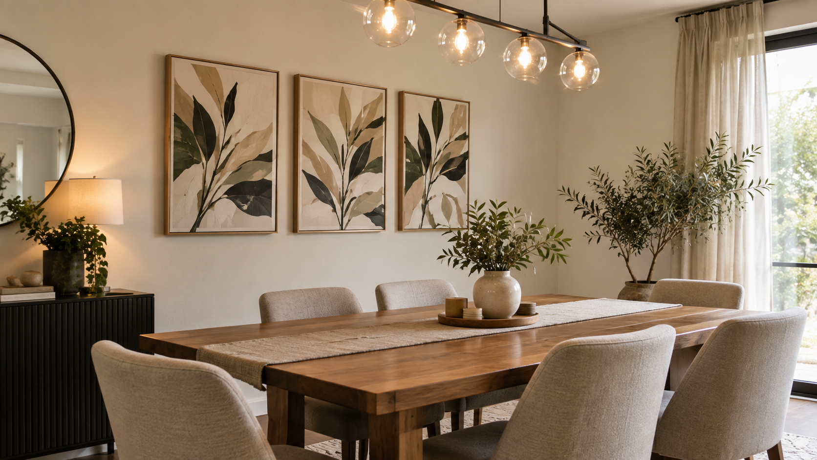
Table of Contents
A bare wall behind a dining table is one of the most common gaps in an otherwise finished room, and it’s usually not for lack of trying — most people just aren’t sure what size or style of wall art for dining table actually belongs there. The wall behind or above a dining table sits at eye level for anyone seated at a meal, which makes it more visible, and more forgiving of mistakes, than almost any other wall in the house.
This guide breaks down how a working designer actually approaches wall art for dining table, in nine specific decisions: proportion, hanging height, style, arrangement, and the small mistakes that make an otherwise good piece of dining table wall decor look wrong. Each secret below is a single, concrete decision — start from the top and work down, and you’ll know exactly what to measure before you buy anything.
1: Size the Art to the Table, Not the Wall
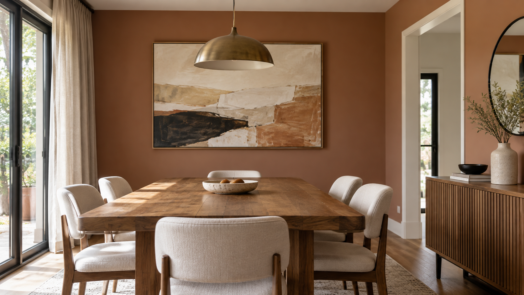
Size is the detail that determines whether wall art for dining table looks deliberate or accidental, and it’s the first secret because getting it wrong undermines every other choice you make after it — it’s the one most people get wrong in the same direction: too small. A piece that reads as generously sized on a screen often shrinks against a real wall once it’s hung above a six-foot table and flanked by chairs on either side.
The working rule used by framers and interior stylists when sizing wall art for dining table is to size the piece to roughly two-thirds the width of the table or the section of wall it’s anchoring. Above a standard 60-inch dining table, that puts you in the 38–42 inch range for a single piece; a smaller 48-inch table suits something closer to 28–32 inches wide. If the wall runs wider than the table itself, measure the open wall space instead of the furniture, since that’s what the eye actually reads.
- Measure the table width first, then the open wall space, and use the smaller of the two as your baseline
- For a 48-inch table, look at art roughly 28–32 inches wide
- For a 60-inch table, look at art roughly 38–42 inches wide
- For a 72-inch or larger table, consider a single large piece or a two-panel set in the 46–50 inch range
- When in doubt, tape a paper template to the wall before buying anything
2: Hang at Seated Eye Level, Not Standing Height
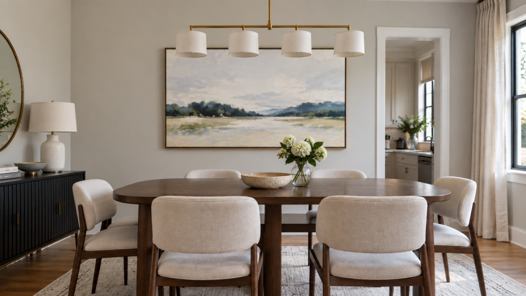
Hanging height is where most otherwise well-chosen wall art for dining table falls apart, because the standard museum rule of 57–60 inches to the center of the piece assumes a standing viewer rather than someone seated at a dining table. Dining rooms are used almost entirely from a seated position, so art hung at strict standing eye level often ends up feeling like it’s floating above the actual activity in the room.
A better approach to hanging art in a dining room is to treat the table, not the floor, as the reference point. If there’s furniture underneath the art — a sideboard, buffet, or console — leave roughly 6 to 10 inches between the top of that furniture and the bottom of the frame, which keeps the two elements visually connected without crowding either one. On a bare wall with no furniture beneath it, centering the piece a few inches lower than the standard 57–60 inch guideline usually reads better once everyone is seated.
- Leave 6–10 inches between the top of a sideboard or buffet and the bottom of the frame
- On a bare wall, center art slightly below standard eye level to suit seated viewing
- Keep at least 30 inches of clearance between the table surface and the bottom of the art if it hangs directly above the table
- Check the height from a seated position at the table, not just standing across the room
- Adjust downward slightly if the room has low ceilings or a low-hanging light fixture
3: Match the Style to How the Dining Room Is Actually Used
Because a dining table is where people linger and talk, the right wall art for dining table tends to work best when it invites a second look rather than acting as purely decorative filler. Botanical prints, abstract compositions, still life, and landscape or travel photography all show up repeatedly on well-designed dining walls because they hold up to close, extended viewing rather than fading into the background after the first glance.
Food and wine-themed prints are the most obvious choice for a dining table wall, but they’re also the most predictable, and predictable art is often the fastest to feel dated. A more durable approach to choosing wall art for dining table is to base it on the mood of the room rather than the literal function of the furniture beneath it — the goal is a wall that still feels right two or three years from now.
Warm, Casual Dining Rooms
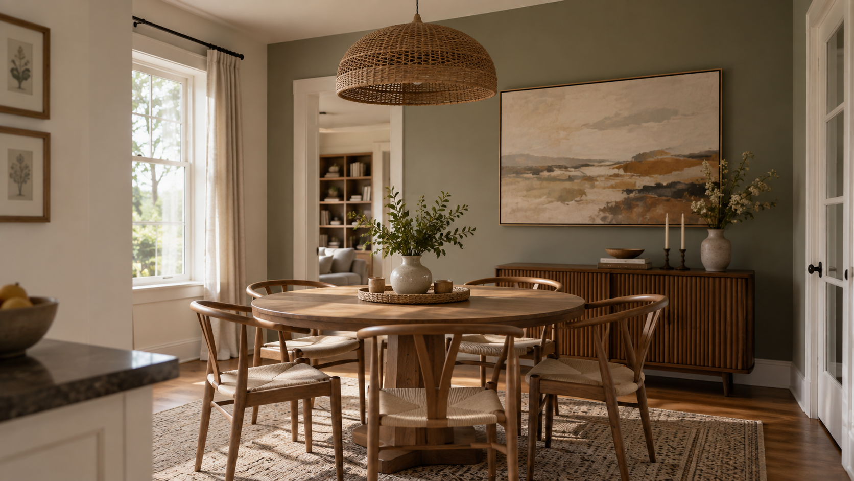
For a relaxed dining nook or family-style dining room, loose botanicals, warm-toned landscapes, and casual photography tend to create an easy, unforced atmosphere. These styles pair naturally with wood tones and mixed textures, and they don’t demand the same precision in framing or spacing that more formal art requires.
Layered arrangements also read as casual by nature, so a small cluster of mismatched frames around a central photograph can work in this setting where it might feel disorganized in a more formal room. The goal in a casual dining space is warmth and personality over strict symmetry.
Formal Dining Rooms
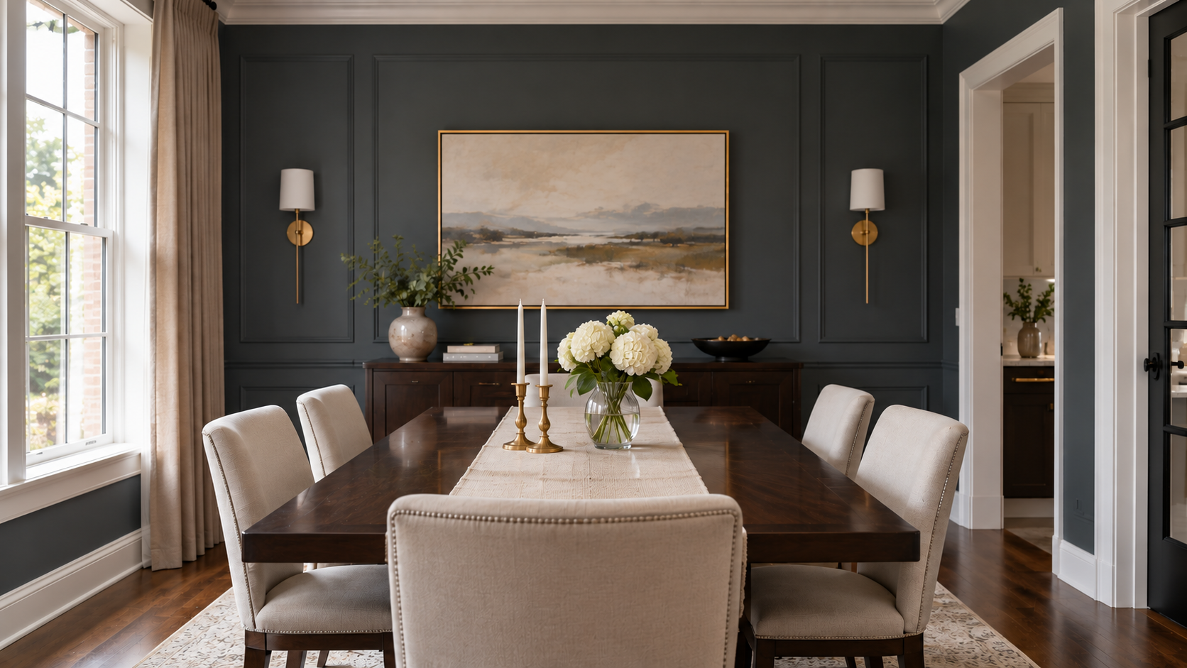
A more formal dining room generally calls for bolder, higher-contrast work — abstract paintings, architectural photography, or a single dramatic print in a substantial frame. Symmetry and clean spacing matter more here, since a formal room reads as intentional partly through its restraint.
Dark, moody palettes also tend to suit formal dining spaces better than pastel or overly bright work, particularly in rooms used mostly for evening meals under warm lighting. One well-scaled piece, centered and framed with some breathing room around it, usually outperforms a busy arrangement in this setting.
4: Decide on One Statement Piece Before You Consider a Dining Room Gallery Wall
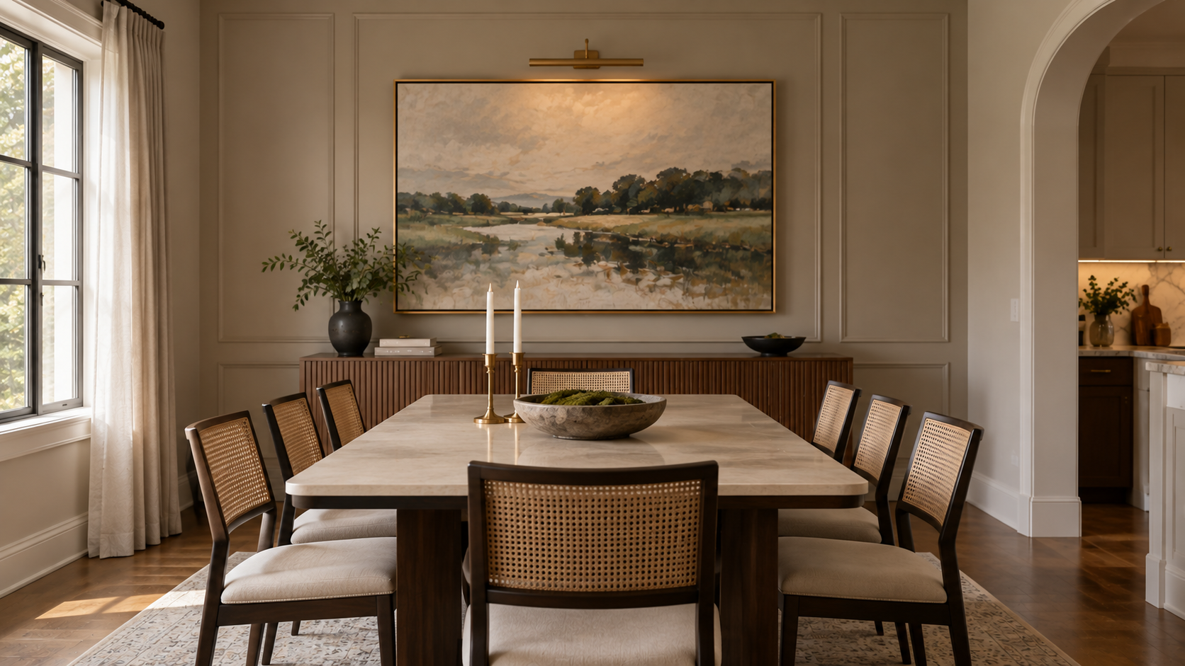
Choosing between one large piece and a dining room gallery wall comes down to how much visual complexity the rest of the room can absorb. A single statement piece of wall art for dining table simplifies the wall, gives the eye one clear place to land, and is generally the lower-risk option if you’re not confident about mixing frames and scales.
A gallery wall, by contrast, brings more personality and storytelling into the space — family photos, travel snapshots, and smaller prints grouped together can say more about the household than any single purchased piece. The trade-off is that a gallery wall takes more planning to avoid looking cluttered, and it usually needs a unifying thread, whether that’s frame color, a shared color palette, or consistent matting, to keep it from reading as chaotic.
- A single large piece works well when the rest of the room already has a lot of pattern, color, or texture
- A gallery wall works well when you want to display personal photos or a mixed collection
- Keep 2–3 inches of consistent spacing between frames in a gallery arrangement
- Pick one unifying element — frame color, mat color, or subject matter — before hanging anything
- Lay the arrangement out on the floor first and photograph it before committing to nail holes
5: Size Up, Not Down, for Wall Art in a Small Dining Table Setup
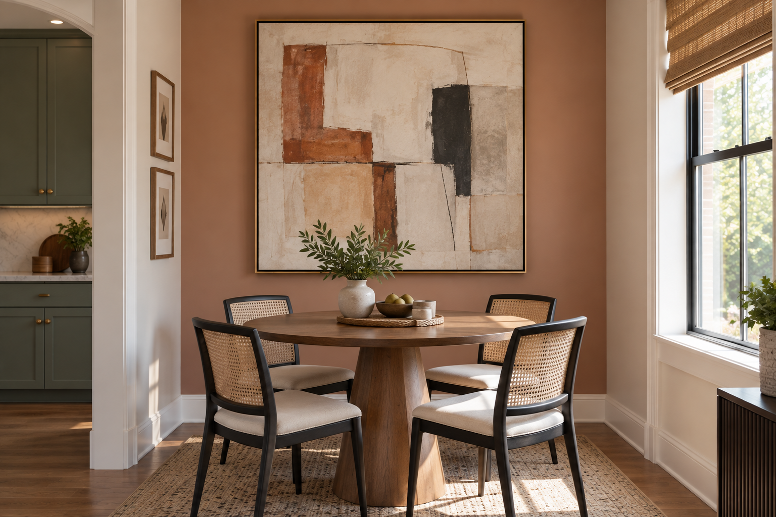
In a small dining nook or an open-plan kitchen-dining area, there’s often a temptation to choose smaller wall art for dining table to match the scale of the room, but that usually backfires. A piece that’s too small on a small wall can look like an afterthought, while a well-proportioned larger piece can actually make a compact dining area feel more finished and less like unused leftover space.
This is the secret most small-space guides skip: vertical orientation tends to work better than wide horizontal wall art for dining table in this kind of tight nook, since it draws the eye upward rather than emphasizing how little floor space is available. Mirrors are also worth considering as an alternative to traditional art in a small dining area — a well-placed mirror can visually double the sense of space while still giving the wall a finished focal point.
- Choose vertical over horizontal orientation in narrow dining nooks
- Don’t undersize the art just because the room is small — stick to the two-thirds width guideline
- Consider a mirror as an alternative or companion to art in a tight space
- Skip heavily textured or deeply framed pieces that protrude into walking paths
- Use one cohesive piece rather than a scattered gallery in rooms under roughly 100 square feet
6: Let Color and Material Do the Heavy Lifting
The color palette of wall art for dining table doesn’t need to match the tablecloth or dinnerware exactly, but it does need to relate to the room’s existing tones in some way, whether through a shared accent color or a deliberate contrast, since color is one of the fastest ways this kind of wall art either blends in or stands out. Warm, rich tones — rust, ochre, deep green, burgundy — tend to feel inviting in a room built around shared meals, while very cool or stark neutral wall art for dining table can read as clinical if it’s the only thing on the wall.
When it comes to wall art for dining table, material matters almost as much as color. A framed print behind glass can create glare under overhead lighting or near windows, which is worth testing on any wall art for dining table before committing to a placement directly across from a light source. Textured options like woven wall hangings, layered wood panels, or unframed canvas avoid that glare problem entirely and add a tactile element that softens a room full of hard surfaces like table wood, tile, or glass.
7: Avoid the Mistakes That Give Away DIY Placement
The single most common mistake with wall art for dining table is undersizing the piece, which leaves the wall looking unfinished even after art has technically been added. The second most common mistake is hanging it too high, following the standard standing-eye-level guideline without adjusting for the fact that dining rooms are experienced from a seated position.
Beyond sizing and height, many people also make the mistake of matching wall art for dining table too literally to the room’s function — food illustrations, wine labels, or kitchen-themed text art can feel gimmicky rather than considered, especially in a more formal dining room. Skipping the paper-template step before buying wall art for dining table is another frequent misstep, since it’s the only reliable way to confirm scale before drilling holes in the wall.
- Buying art that’s too small relative to the table or wall
- Hanging the piece at standing eye level in a room used mostly while seated
- Choosing overly literal food or kitchen-themed art in a formal setting
- Ignoring glare from glass-framed pieces near windows or overhead lighting
- Skipping a paper mock-up before committing to a final placement
8: Get Statement-Size Dining Table Wall Decor Without a Statement-Size Budget
High-impact dining table wall decor doesn’t require an expensive original piece. Upscaling a favorite photograph — a vacation shot, a family portrait, or a high-resolution landscape image — into a large custom print is often the most cost-effective way to get a statement-sized piece without paying gallery prices, and many print services now offer custom sizing to fit an exact wall.
Clustering several inexpensive prints into a single grouped arrangement is another lower-cost route to the same visual weight as one large piece of wall art for dining table, and it has the added benefit of being easy to update over time. Thrifted or vintage frames refinished with fresh paint or fabric backing can also stand in for higher-end framing on wall art for dining table at a fraction of the cost.
- No-cost option: rehang or reframe art you already own in a better spot or arrangement
- Low-cost option: print a personal photo large through an affordable custom printing service
- Moderate-cost option: buy 3–5 smaller prints and group them into a gallery cluster
- Higher-investment option: commission a piece from a local or emerging artist
- Refinish a thrifted frame instead of buying new framing for a custom-sized print
9: Treat the Wall as a Living Layout, Not a One-Time Purchase
Art above a dining table takes more day-to-day exposure than art elsewhere in the house, from cooking steam in open-plan spaces to the occasional splash during a meal. Glass-framed pieces are easier to wipe clean, while unframed canvas or textured hangings should be kept farther from the kitchen side of an open-plan layout if steam or grease is a regular concern.
It’s also worth revisiting your wall art for dining table every year or two rather than treating the first choice as permanent. Swapping a seasonal print, rotating pieces from other rooms, or simply reframing an existing piece can keep the space feeling current without the cost or commitment of starting over, and it’s a natural way to test whether a different size or style of wall art for dining table might suit the room even better than the original choice.
FAQ
Start by measuring two things: the width of your table, and the width of the open wall space where the art will hang — then use whichever number is smaller as your baseline. The working rule is roughly two-thirds of that measurement. For a 48-inch table, that lands around 28–32 inches wide; for a 60-inch table, 38–42 inches; for a 72-inch or larger table, 46–50 inches, or a two-panel set if one piece that large is hard to find. If the wall is noticeably wider than the table (for example, in an open-plan space), size to the wall instead of the furniture, since that’s what the eye reads first when entering the room. Before ordering anything, tape a paper template cut to the exact dimensions onto the wall and view it from a few different spots in the room — this catches sizing mistakes for free, before you’ve spent money on a piece that turns out too small.
The reference point changes depending on what’s on the wall. If the art hangs above a sideboard, buffet, or console, measure up 6 to 10 inches from the top of that furniture to the bottom of the frame — this keeps the piece visually anchored to the furniture instead of looking like it’s floating separately above it. If the art hangs on a bare wall with nothing underneath it, the standard interior-design guideline is to center it 57 to 60 inches from the floor to the midpoint of the piece, but that number assumes a standing viewer. Since dining rooms are used almost entirely while seated, drop that centerline by a few inches so the art reads correctly from chair height, not just from across the room. If the art hangs directly above the table itself rather than a sideboard, keep at least 30 inches of clearance between the tabletop and the bottom of the frame so it doesn’t interfere with anyone leaning back or a centerpiece underneath it. Whatever height you land on, sit down at the table and check the sightline before you commit to nail holes — a height that looks right standing across the room can look too high the moment you sit down.
It depends on how much else is already happening visually in the room, and how much time you want to spend on planning the layout. A single large piece is the simpler, lower-risk choice: it gives the eye one clear focal point, requires no spacing decisions, and tends to work best in rooms that already have pattern, texture, or color elsewhere — a patterned rug, an accent wall, or statement light fixture. A gallery wall takes more upfront planning but adds more personality, since it can mix personal photos, travel prints, and smaller art in a way a single piece can’t. To make a gallery wall work, pick one unifying element before you start — the same frame color, the same mat width, or a consistent color palette across the pieces — and keep spacing between frames consistent, typically 2 to 3 inches apart. Lay the whole arrangement out on the floor first, take a photo of it from above, and adjust before you put a single nail in the wall; this is the step that prevents most gallery-wall regret.
Because dining rooms are used for long stretches at a time, the art needs to hold up to repeated, close viewing rather than just looking good on a first pass. Botanical prints, abstract compositions, still life, and landscape or travel photography consistently perform well because they have enough visual detail to stay interesting over multiple sittings without becoming distracting. Food and wine-themed art is the most literal choice for a dining room, but it’s also the first style to feel dated or gimmicky, so if you’re drawn to it, treat it as one piece in a mix rather than the sole focal point. For a casual or family dining space, warmer and looser styles — botanicals, casual photography, mixed-frame galleries — tend to feel more natural. For a formal dining room, bolder, higher-contrast, or more architectural pieces in a single substantial frame usually read as more intentional than a busy arrangement.
Both can work, but the choice should be based on the mood you want at the table, not a fixed rule. Warm, saturated tones — rust, ochre, deep green, burgundy — tend to feel inviting and convivial in a room built around shared meals, which is why they show up so often in dining spaces specifically. Very cool, stark, or heavily desaturated neutral art can read as clinical or cold if it’s the only piece on the wall, especially in a room with warm wood furniture or warm lighting. If you’re unsure, look at the undertones already in the room — the wood finish, the wall paint, the light fixture — and choose art that either matches those undertones or deliberately contrasts them for effect, rather than picking a color in isolation. A useful test: view the art swatch or a printed sample under the room’s actual evening lighting before committing, since colors often read differently under warm bulbs than they do on a screen or in a showroom.
Yes, and it solves a specific problem that art can’t: a mirror adds the appearance of depth and light to a room, which is especially useful in a small dining nook, a windowless dining area, or an open-plan space that needs to feel less boxed in. Size it the same way you would a piece of art — roughly two-thirds the width of the table or sideboard beneath it — and hang it so the reflection captures something worth seeing, like a window, a light fixture, or an adjacent room, rather than a blank wall or the back of a cabinet. Mirrors also work well paired with art rather than as a strict either-or choice — for example, a mirror on one wall and a piece of art on an adjacent wall gives the room two focal points without doubling up on the same visual idea. One practical note: avoid positioning a mirror directly across from a bright window if it will create glare at the dining table during meals, particularly in the evening with overhead lighting.
The most cost-effective route is usually to upscale a photo you already have — a vacation shot, a family photo, or a high-resolution landscape image — into a large custom print through an affordable printing service, since many now offer exact custom sizing rather than fixed standard dimensions. This gets you a statement-sized piece for a fraction of what an equivalent original artwork or licensed print would cost. A second option is to cluster several smaller, inexpensive prints into a single grouped arrangement; this creates the same visual weight as one large piece and is easier to expand or rearrange later if your taste changes. A third option, often overlooked, is refinishing a thrifted or vintage frame with new paint or fabric backing and using it for a custom print — this gets you higher-end framing without paying full retail for both the frame and the print separately. Whichever route you choose, resist the urge to size down to save money; a too-small piece often ends up looking cheaper than a well-sized budget print, so keep the two-thirds width guideline even when you’re working with a smaller budget.
Glare comes from two main sources: direct window light hitting glass at certain times of day, and overhead or pendant lighting reflecting off the glass surface at eye level. Before hanging anything, check the wall at the times of day you actually use the dining room — a wall that looks fine at noon can develop glare during an evening meal once artificial lighting comes on. If a wall consistently produces glare, either move the art to an adjacent wall out of the direct light path, or switch from a glass-framed piece to something without a reflective surface, such as unframed canvas, a printed wood panel, or a textured wall hanging. Non-glare or museum glass is also an option if you’re set on a specific glass-framed piece and can’t change its position, though it costs more than standard glass. If glare is only a problem during certain hours (for example, only at sunset), it may be simpler to add a curtain, blind, or dimmer on the overhead fixture than to change the art itself.
Love inspiring interiors, practical design ideas, and beautiful spaces? Follow us on Facebook, Instagram, and Pinterest for more interior inspiration, home styling ideas, and everyday design tips.