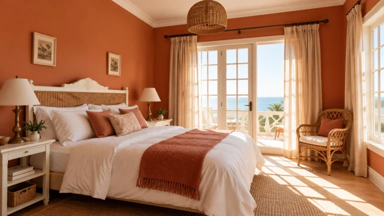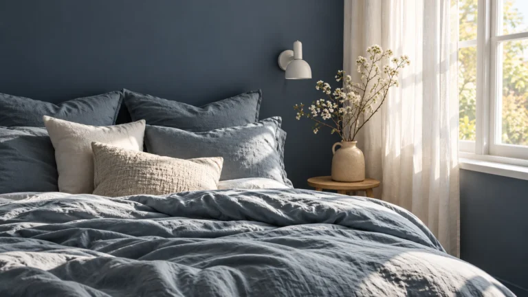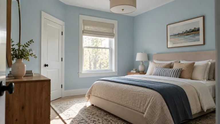

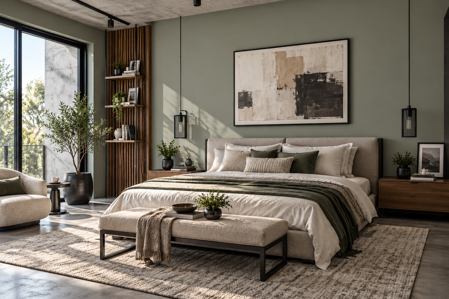
The calm bedroom paint colors are usually muted rather than highly saturated: warm whites, soft greiges, gray-tinged blues, blue-greens and dusty sage greens.
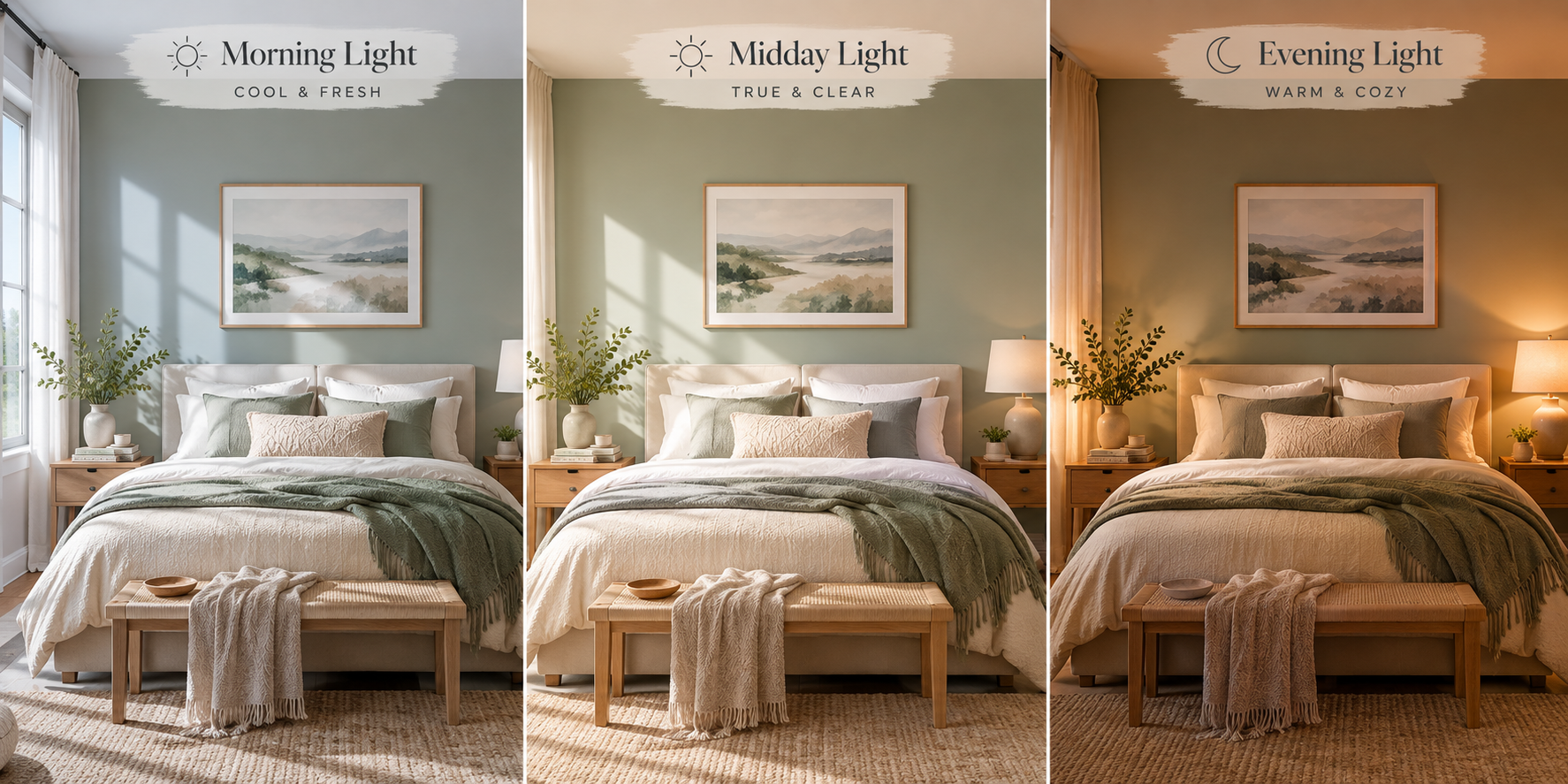
But the color on the paint chip is only half the decision. Your bedroom’s natural and artificial light can completely change how that color feels. A blue-gray that looks soft and restful in a bright bedroom can look colder and flatter in a dim room.
Start with your room’s light, then narrow your choices.
In this guide — jump to what you need
Which calm color fits your bedroom?
| Your room | What the light tends to do | What to look for | Colors to start with |
|---|---|---|---|
| North-facing | Cooler indirect light can emphasize blue and gray undertones. | Warmer whites, greiges, blushes and muted warm neutrals. | Calm, Alabaster, Agreeable Gray, Pink Cloud |
| South-facing | Usually receives stronger, warmer light for much of the day. | Soft greens, blue-greens and slightly deeper muted shades can work well. | Quiet Moments, Sea Salt, October Mist, Evergreen Fog |
| East-facing | Warm morning light becomes cooler later in the day. | Balanced colors that still look good once the morning warmth disappears. | Camouflage, Quiet Moments, Calm |
| West-facing | Cooler earlier in the day, with stronger warm light later. | Muted shades that don’t become excessively warm in late-afternoon sun. | Sea Salt, Quiet Moments, Camouflage |
| Small or dim | Less available light can make deeper colors feel heavier. | Lighter colors if you want an airy effect, or intentionally darker colors if you want a cocooning room. | Calm, Alabaster, Sea Salt |
What’s LRV? Light Reflectance Value measures how much visible light a paint color reflects on a scale from 0 to 100. Lower-LRV colors generally appear darker, while higher-LRV colors reflect more light.
LRV is useful, but don’t choose bedroom paint by LRV alone. Two paints with similar LRVs can look completely different because of their undertones, your window direction, flooring, furniture and bulbs. Use LRV to understand approximately how light or dark a color is, then test the actual paint in your room.
10 calm bedroom paint colors
Rather than looking for one universally “calming” color, choose a shade that works with your bedroom’s light and the materials already in the room.
Warm neutrals and blush
These are especially useful when you want a bedroom to feel soft, warm and easy to decorate.
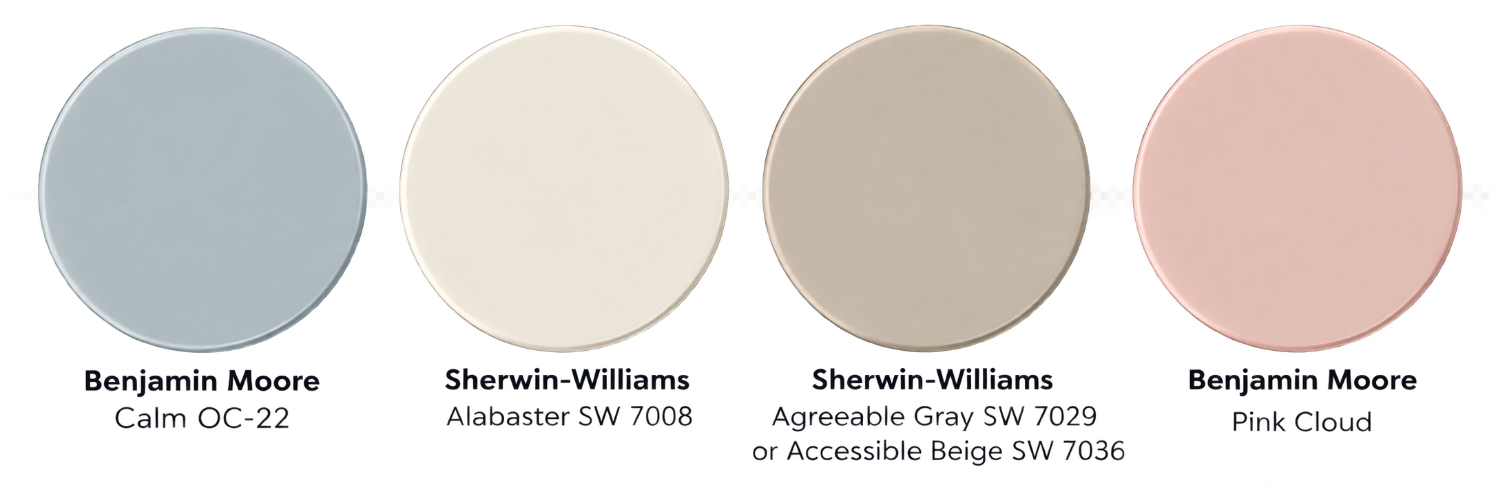
1. Benjamin Moore Calm OC-22
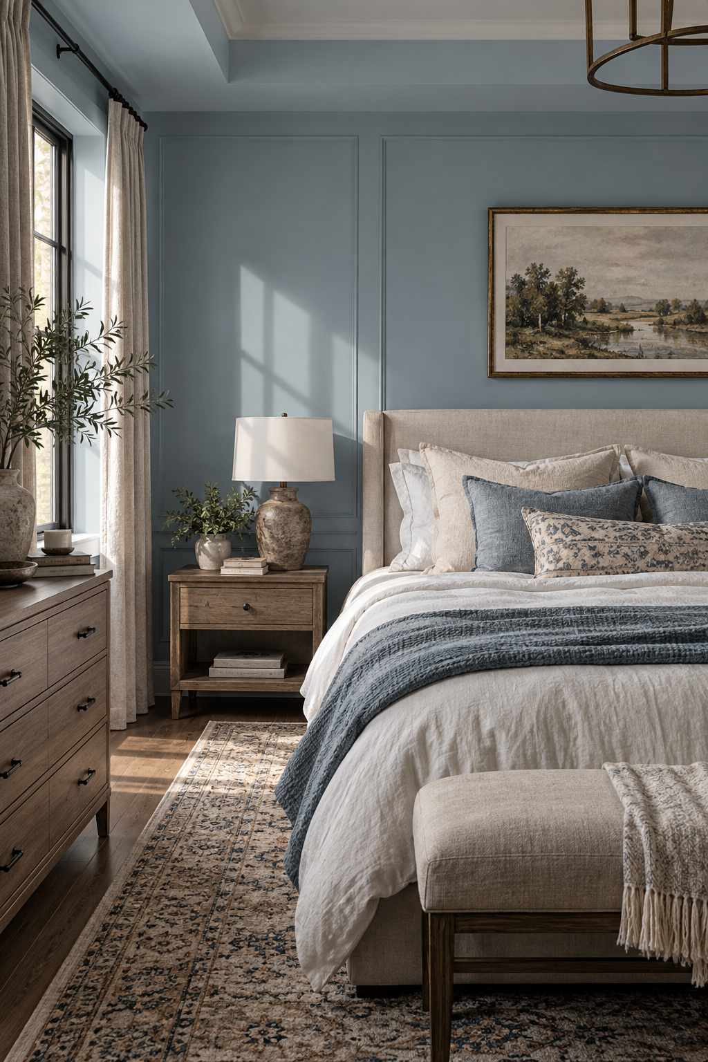
Calm is a soft off-white with subtle warmth. Its light appearance makes it a useful starting point for bedrooms that don’t receive much natural light or where you want an airy look.
For a relaxed bedroom, pair it with natural oak, cream or oatmeal bedding, warm white curtains and muted beige or taupe accents. If you want the walls to make more of a statement, however, Calm may be too close to an off-white.
Best starting point: North-facing, small or softly lit bedrooms.
Watch for: In a very bright room, it may appear lighter and more neutral than expected.
2. Sherwin-Williams Alabaster SW 7008
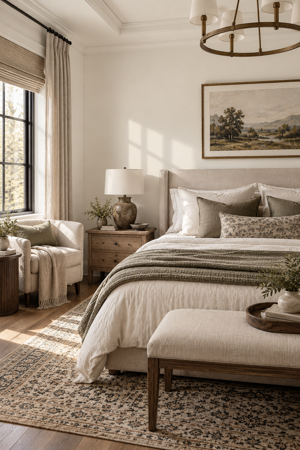
Alabaster is a warm off-white rather than a stark, cool white. That warmth can be useful in bedrooms where cooler natural light makes cleaner whites feel slightly harsh.
Pair it with warm wood furniture, linen bedding, woven textures, beige, tan or muted green accents. It also works well when you want a neutral backdrop and prefer your bedding and furniture to provide most of the color.
Best starting point: North-facing and neutral bedrooms.
Watch for: Warm artificial lighting can make creamy whites appear warmer at night, so always check your sample with the lamps you actually use.
3. Sherwin-Williams Agreeable Gray SW 7029 or Accessible Beige SW 7036
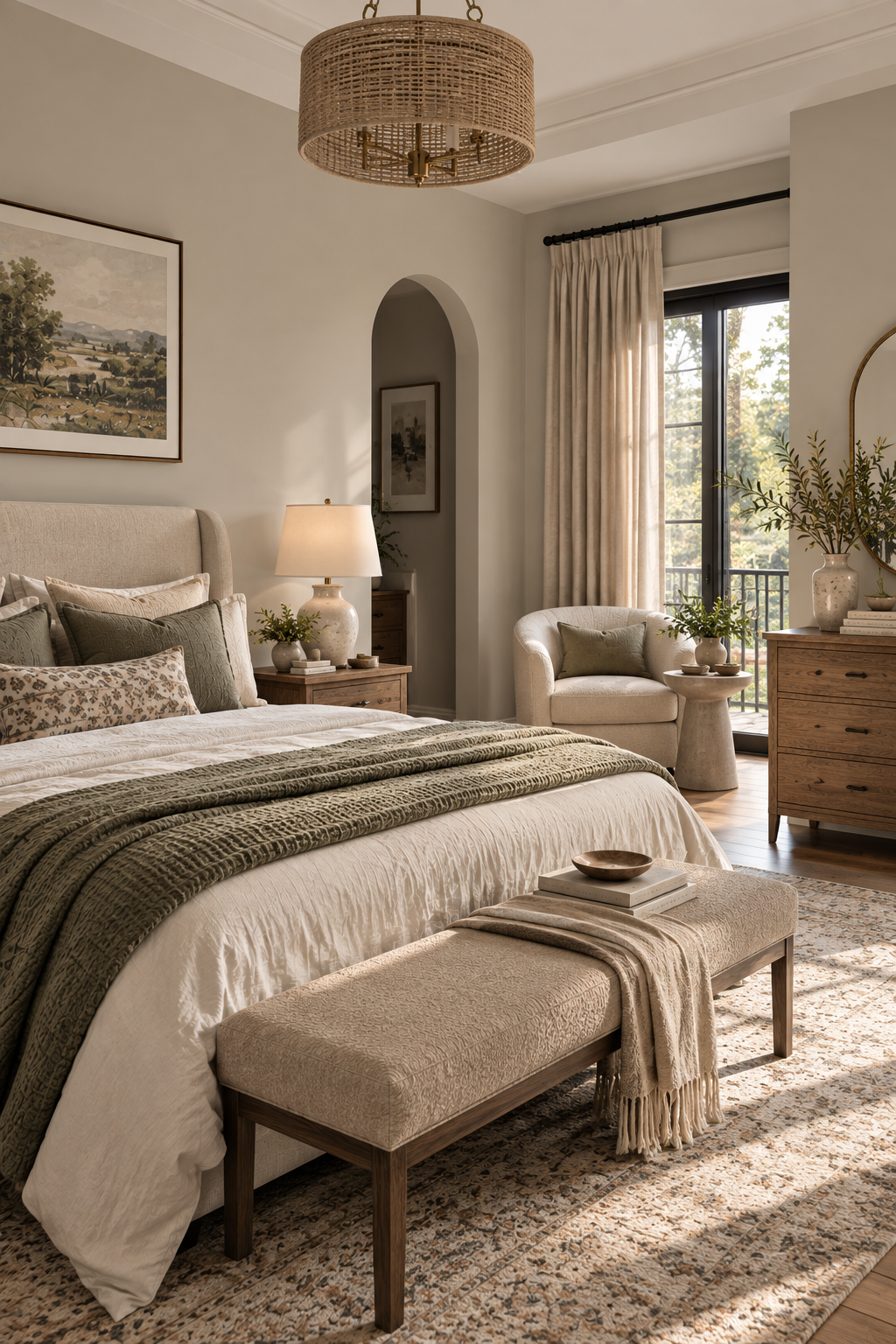
If plain white feels too empty but traditional gray feels too cool, a warm greige can sit comfortably between the two.
Agreeable Gray is the grayer option, while Accessible Beige brings more warmth. Both can create a neutral background that works with changing bedding and furniture.
Try them with white or cream bedding, walnut or oak furniture, muted sage accessories and textured fabrics.
Best starting point: Bedrooms where you want a flexible neutral rather than obvious color.
Watch for: Every greige can shift warmer or cooler depending on flooring and natural light. Compare the sample directly with your carpet, wood flooring and bedding.
4. Benjamin Moore Pink Cloud
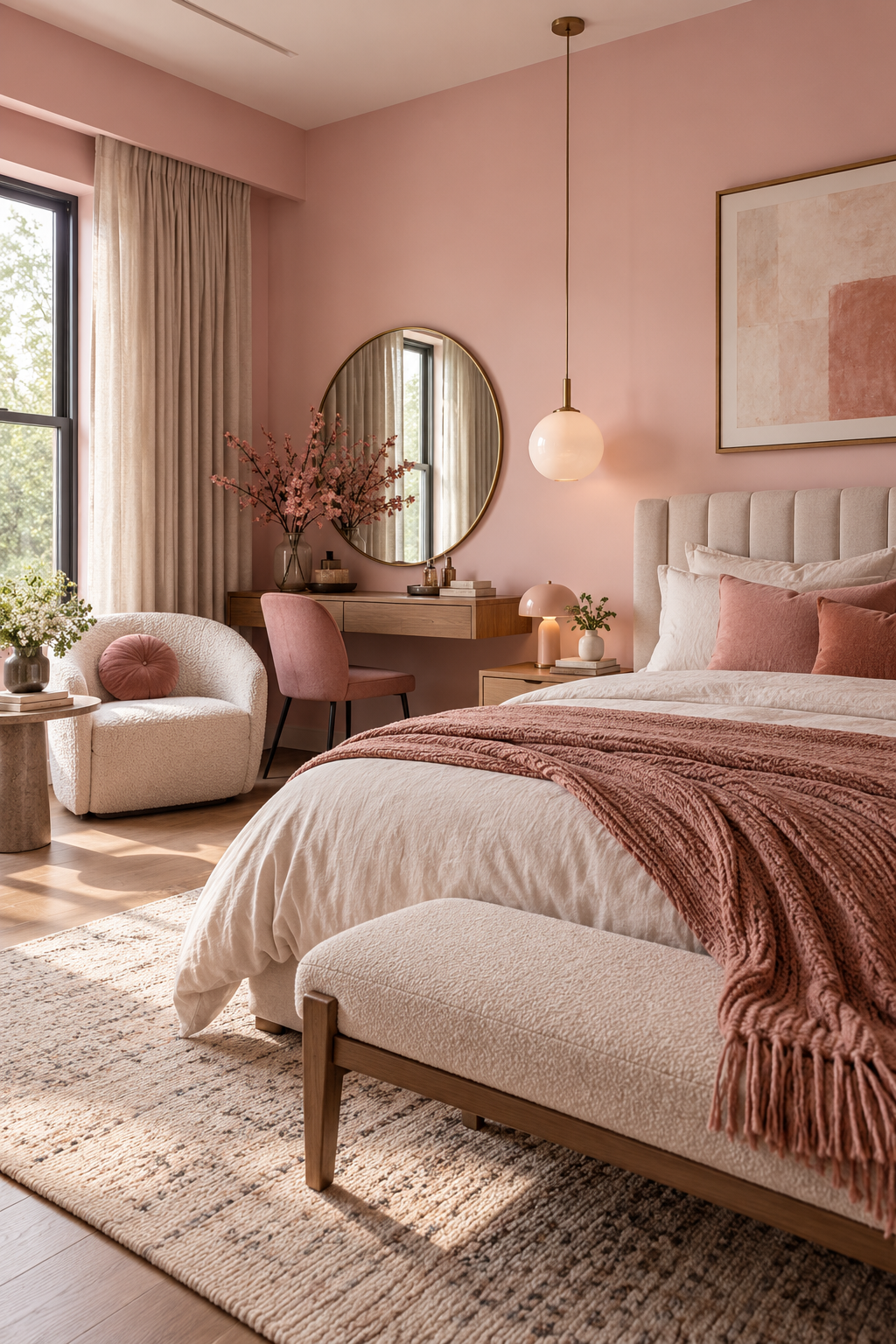
A muted blush can make a bedroom feel warmer without turning it into a bright pink room. This is particularly useful if your bedroom receives cooler natural light and you want something softer than beige.
Keep the rest of the room restrained: cream bedding, natural wood, warm white trim and muted brown or taupe accents help a blush wall feel grown-up rather than overly sweet.
Best starting point: Bedrooms that need warmth and a little more personality than an off-white.
Watch for: Pink undertones become much more obvious beside cool whites, so test your trim color at the same time.
Blue-grays and blue-greens

Muted blues and blue-greens can create a softer alternative to straightforward blue. Their gray or green undertones keep them from feeling overly bright.
5. Benjamin Moore Quiet Moments 1563
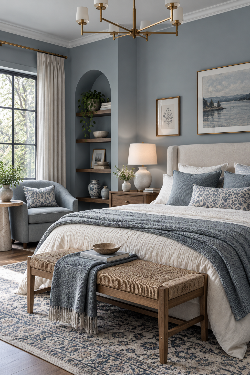
Quiet Moments sits between blue, green and gray. Which side you notice most will depend heavily on the room.
Instead of trying to force it to look blue or green, build around its changing character. Pair it with soft white bedding, pale or medium wood, warm beige textiles and simple natural materials.
Best starting point: Bedrooms with moderate to good natural light where you want visible color without a highly saturated wall.
Watch for: It can shift noticeably between daylight and warm artificial light. Sample it before committing.
6. Sherwin-Williams Sea Salt SW 6204
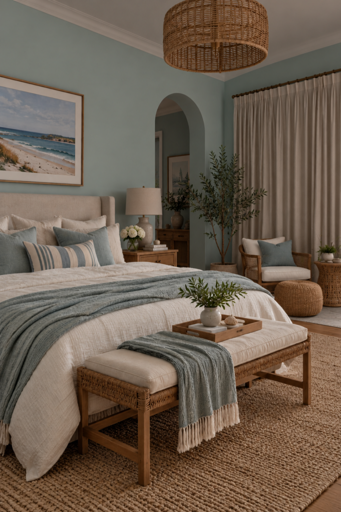
Sea Salt is a light, muted green-blue that can feel fresher than a beige or greige while remaining relatively understated.
It’s a good option when you want some color but don’t want the room to feel dark. Pair it with white or cream bedding, natural wood, woven baskets and restrained blue, green or sandy accents.
Best starting point: Small bedrooms, coastal-inspired rooms and spaces where you want a lighter green-blue.
Watch for: Strong natural light can make subtle colors look considerably lighter, while different exposures may emphasize either the green or blue undertone.
Muted greens
Sage and gray-green walls work particularly well with the natural materials commonly used in calm bedrooms: wood, linen, cotton, rattan and warm neutral fabrics.
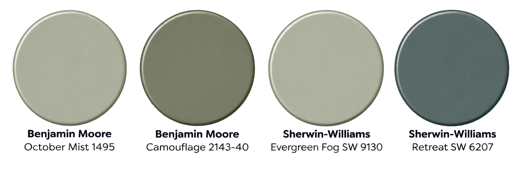
7. Benjamin Moore October Mist 1495
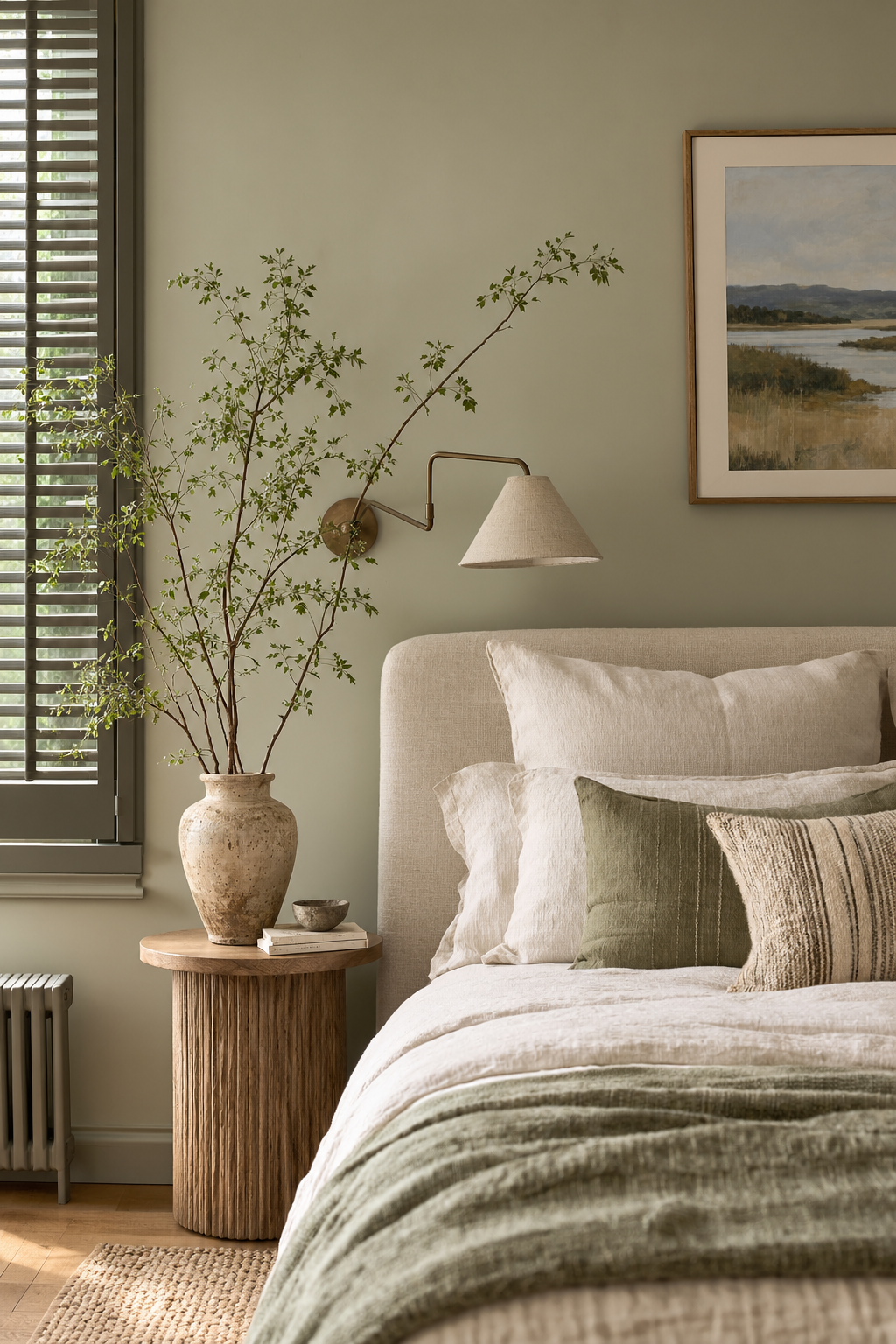
October Mist is a muted sage rather than a bright botanical green. It gives a bedroom more presence than an off-white while remaining easy to combine with neutral furnishings.
Pair it with warm white trim, oatmeal or cream bedding, medium-toned wood and small black or bronze accents.
Best starting point: Bedrooms where you want an obvious but subdued wall color.
Watch for: Because it’s deeper than the lightest colors in this guide, test it in the darkest part of your bedroom before painting all four walls.
8. Benjamin Moore Camouflage 2143-40
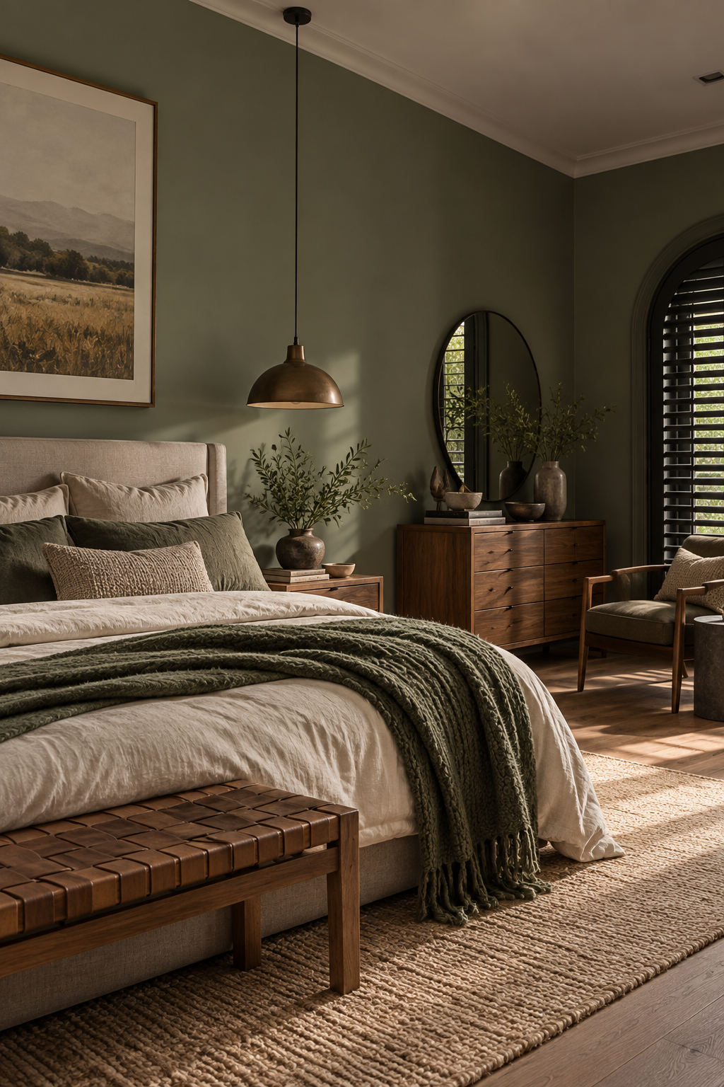
Camouflage bridges green and neutral, which makes it useful when you like sage but don’t want the room to feel distinctly green.
It works especially well with wood furniture, off-white bedding, tan leather, linen and muted earthy accessories.
Best starting point: Natural, earthy bedroom schemes and rooms where furniture or artwork should remain the focus.
Watch for: Nearby beige, green and gray materials can pull different undertones from the paint.
9. Sherwin-Williams Evergreen Fog SW 9130
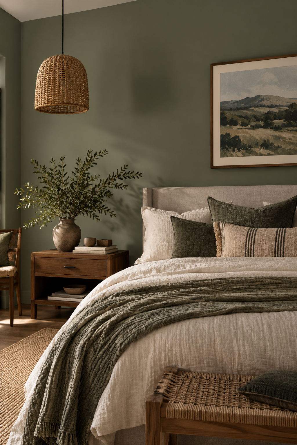
Evergreen Fog is considerably deeper than Sea Salt. Choose it when you want the walls to contribute to the mood rather than simply provide a light neutral background.
Its gray-green character pairs naturally with cream bedding, warm wood, brass or black details and soft neutral textiles.
Best starting point: Brighter bedrooms or rooms where you deliberately want a richer, more enveloping effect.
Watch for: In a dim bedroom it will look substantially deeper than a pale sage. Don’t select it from a small paint chip alone.
10. Sherwin-Williams Retreat SW 6207

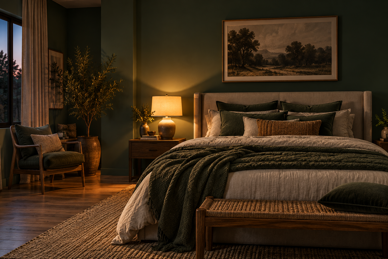
Retreat is the darkest and most dramatic option in this group. Instead of trying to make the room look bright, use it when you want a more cocooning bedroom.
Balance the deeper walls with light bedding, warm bedside lamps, natural wood and lighter curtains. Repeating the wall color in small textiles or accessories can also make the scheme feel intentional.
Best starting point: Bedrooms where a deep, enveloping atmosphere is part of the design.
Watch for: Deep colors absorb more light visually, so test Retreat during the darkest part of the day as well as under your bedside lighting.
Can a dark bedroom still feel calm?
Absolutely. A calm bedroom doesn’t have to be pale. Deep sage, muted blue, charcoal and other low-saturation dark colors can create a cozy, enclosed feeling. The important question is whether that’s the atmosphere you actually want.
If your bedroom is already small or receives little daylight, a dark wall color will generally make the space feel visually heavier rather than brighter. That isn’t necessarily a problem. A deliberately cocooning bedroom can be very effective.
If you choose a deeper wall color, balance it with:
- Light or medium-tone bedding
- Warm bedside lamps
- Soft curtains
- Natural wood
- A restrained color palette
- Several sources of light instead of relying only on one ceiling fixture
Does paint color really help you sleep?
Don’t choose a bedroom paint color expecting it to function as a sleep treatment. Color can influence how you perceive a room and whether the space feels relaxing to you, but sleep is affected by many more important factors, including light exposure, noise, temperature, comfort and personal sleep habits.
Claims such as “blue is the best color for sleep” are often based on surveys, associations or limited evidence rather than proof that painting a bedroom blue directly improves sleep. A better decorating rule is simple: choose a color that you personally find comfortable and non-distracting, then create a bedroom environment that supports winding down.
Colors that can be harder to make feel calm
There are no universally “bad” bedroom colors, but some require more care.
- Cool gray and bluish-gray: In rooms with cool or limited natural light, these can feel flatter or colder than they did on the sample.
- Pastel blue: A clean pastel blue can become surprisingly chilly across four walls. Muted blue-gray or blue-green is often easier to combine with bedroom materials.
- Bright mint: Highly saturated mint can feel more energetic than restful. A grayer sage is a softer alternative.
- Charcoal in a dim room: It can create a beautiful cocooning effect, but it will not make an already dark room feel brighter.
- Strong red, orange and yellow: These create much more visual energy than the muted palette used throughout this guide. If you love them, consider introducing them through pillows, artwork or another smaller accent instead of automatically covering every wall.
Test your top three the way a bedroom is actually used
This is more important than trying to find the “perfect” color online. You’ll need three samples or large peel-and-stick swatches. If you’re using wet paint samples, large movable boards make comparison easier.
1. Narrow your list to three colors.
More choices aren’t necessarily helpful. Pick three that work with your room direction, furniture and the atmosphere you want.
2. Make the samples large.
A tiny paint chip isn’t enough to judge how a color will behave across an entire wall. Use large sample boards or manufacturer-approved removable samples. If you’re painting boards, follow the paint manufacturer’s instructions for application and number of coats.
3. Compare them with the things that are staying.
A beautiful wall color that clashes with your existing floor isn’t the right color for that bedroom. Place your samples beside:
- Bedding
- Flooring or carpet
- Headboard
- Curtains
- Wood furniture
- Trim
4. Move the samples around the room.
Check the wall beside the window, the wall behind the bed and the darkest corner. The same paint can look surprisingly different across one room.
5. Check them morning, afternoon and night.
Natural light changes throughout the day. Then turn on the bedside lamps and check again. Artificial light matters too. Warmer bulbs can make warm undertones more noticeable, while cooler light can emphasize blue and gray.
6. Live with the finalists for a couple of days.
Don’t choose immediately after putting the samples up. Look at them when you wake up, during daylight and when you’re actually winding down at night. The winner should work with the room, not just look impressive on a paint chip.
Sheen, ceiling and trim
Color isn’t the only paint decision. For bedroom walls, matte and eggshell are both common choices. Matte gives walls a softer, lower-reflection appearance and can help disguise minor surface imperfections. Eggshell adds a slight sheen and is often chosen when easier cleaning is important.
For ceilings, flat or matte finishes are commonly used because they minimize reflected light and help disguise imperfections. Your trim doesn’t automatically have to be brilliant white either. A softer white can sit more comfortably beside warm whites, greiges and sage greens.
For a simple scheme, choose:
Walls: your main calm color
Trim: a compatible soft white
Ceiling: flat or matte white or a coordinated light neutral
Bedding: one or two shades lighter or darker than the walls
Accent: one restrained complementary color
In older homes, be cautious before sanding or disturbing existing paint. Older coatings may contain lead, and appropriate testing and safety procedures may be necessary.
Should you paint the whole room or just one wall?
If your goal is a calm, continuous bedroom, painting all four walls the same muted color is usually the simplest approach. An accent wall is useful when you intentionally want to emphasize something—the bed wall, architectural detail or another focal point.
Don’t decide based on LRV alone. For a calm room, ask:
Do I want continuity?
Use the color throughout the room.
Do I want a focal point?
Consider one accent wall while keeping the surrounding walls quieter.
A deep green behind a bed, for example, can work beautifully with warm off-white surrounding walls, but a pale sage may be more effective across the entire room.
Do I need primer when changing from a bold color to a calm one?
Not necessarily.
If the existing wall is sound and the new paint is designed to provide good coverage, a separate primer may not always be required. Primer becomes more useful when you’re making a dramatic color change, dealing with repaired or porous surfaces, covering stains, or working with a surface for which the paint manufacturer recommends priming.
Going from a very dark or saturated wall to a pale calm color may require additional preparation or coats. Don’t automatically assume that gray primer is required just because the existing color is bold. The appropriate primer—and whether you need one at all—depends on the surface, existing color and new topcoat. Follow the manufacturer’s instructions for the specific paint you’re using.
How much does it cost to repaint a bedroom?
For professional painting in the U.S., a typical bedroom can cost several hundred dollars, with commonly published estimates around $350–$850 for many standard bedroom projects. Treat that as a budgeting range rather than a quote. The actual price can change depending on:
- Bedroom size and ceiling height
- Local labor rates
- Wall condition
- Holes, cracks or drywall repairs
- Number of coats
- Existing and new colors
- Paint quality
- Whether you’re also painting ceilings, doors or trim
A simple repaint of sound walls will usually cost less than a bedroom requiring extensive preparation and multiple surfaces.
Your next step
Don’t choose ten colors. First, determine how your bedroom is lit. Then choose three colors from the appropriate family in this guide. Bring those three into the actual room and compare them with your flooring, furniture, bedding and trim.
Check them in daylight. Then check them again at night with your bedside lamps on. The best calm bedroom color isn’t the one that looks best online. It’s the one that still feels right in your room when you’re actually using the bedroom.
FAQs
For professional painting in the U.S., a typical bedroom may cost around $350–$850, but that figure should be treated as a general estimate rather than a fixed price. Current HomeGuide data lists roughly $350–$850 for a bedroom, while its broader room-painting estimate is about $300–$1,000 for walls only. Costs can rise substantially for larger bedrooms or when ceilings, trim, doors, extensive preparation, or wall repairs are included. HomeGuide
Room size and ceiling height affect the amount of paint and labor required. The condition of the walls matters too: cracks, holes, damaged drywall, stains, or significant surface preparation can increase labor costs. The number of coats, paint quality, local labor rates, and the difference between the existing and new colors can also affect the final price. HomeGuide
If you’re budgeting for a project, get an estimate based on the actual room rather than relying solely on a national average.
Not always, but primer can be very useful when making a dramatic color change. If the existing wall is in good condition and you’re using a high-quality, self-priming interior paint, you may be able to cover the old color with two coats without applying a separate primer. Benjamin Moore specifically notes that previously painted, undamaged walls generally don’t require primer and that some premium paints can handle many color changes in two coats. Benjamin Moore
However, going from a very dark, saturated, or bold color to a much lighter shade can make coverage more difficult. A high-hiding primer can conceal the old color, create a more uniform base, and potentially reduce the number of finish coats required. Benjamin Moore recommends primer for dramatic color changes, while Sherwin-Williams identifies a large difference between the old and new colors as one cause of poor hiding. Benjamin Moore
The primer color should also be chosen for the new paint color, not simply because the old wall is bold. Sherwin-Williams recommends white or light-gray primer for many lighter and brighter topcoats, while certain deep or vivid colors perform better over specifically tinted gray primers. For example, gray primer is commonly recommended when painting with certain reds, but that does not mean gray primer is always necessary when you’re covering an existing red wall with a light neutral. Sherwin-Williams
For a major color change, check the paint manufacturer’s instructions or ask the paint retailer which primer or tinted base is recommended for your specific topcoat.
There isn’t a universal rule based on LRV alone. LRV (Light Reflectance Value) tells you how much visible light a paint color reflects; it does not determine whether you should paint one wall or the entire room. The decision is primarily a design choice based on the effect you want.
If your goal is a quiet, cohesive, and continuous atmosphere, using the same light-to-mid-tone color on all four walls is often the more straightforward approach. Keeping the wall color consistent reduces strong visual breaks and allows furniture, textiles, artwork, and lighting to provide contrast.
An accent wall makes more sense when you deliberately want one part of the room to stand out—for example, the wall behind a bed, fireplace, or another architectural feature. Accent walls can introduce a stronger or complementary color without applying it throughout the room. Sherwin-Williams, for example, suggests combining lighter bedroom walls with a complementary accent wall as one approach to a relaxing two-color bedroom scheme. Sherwin-Williams
So, if calm continuity is the main goal, painting the whole room one coordinated color is a reasonable choice. If you want a focal point or stronger contrast, an accent wall may work better. LRV should help you evaluate how light or dark the color will feel, rather than serve as a rule for deciding how many walls to paint.
Love inspiring interiors, practical design ideas, and beautiful spaces? Follow us on Facebook, Instagram, and Pinterest for more interior inspiration, home styling ideas, and everyday design tips.